If you haven’t heard of or tasted Patsy’s Candies, you’re definitely missing out. Patsy’s is one of Colorado’s longest-running family-owned confectionery companies. Founded in 1903 by Irish immigrant Patsy Mehaney, the company began with a dream to spread joy through handmade sweet treats. For over a century, Patsy’s has stayed true to that dream; and I wanted to honor that legacy through their rebrand.
Patsy’s Candies
Programs
Illustrator, InDesign, & Photoshop
Project Type
Company Rebrand
Purpose
Rocky Mountain College of Art + Design Course Project
Year
2025
I started by sketching shapes and lettering that felt nostalgic and handmade, just like the brand itself. These rough ideas helped me figure out how to modernize Patsy’s without losing that old-school charm. Nothing fancy; just pencil, paper, and a box of Patsy’s seasonal fudge.
It all Starts with a Sketch
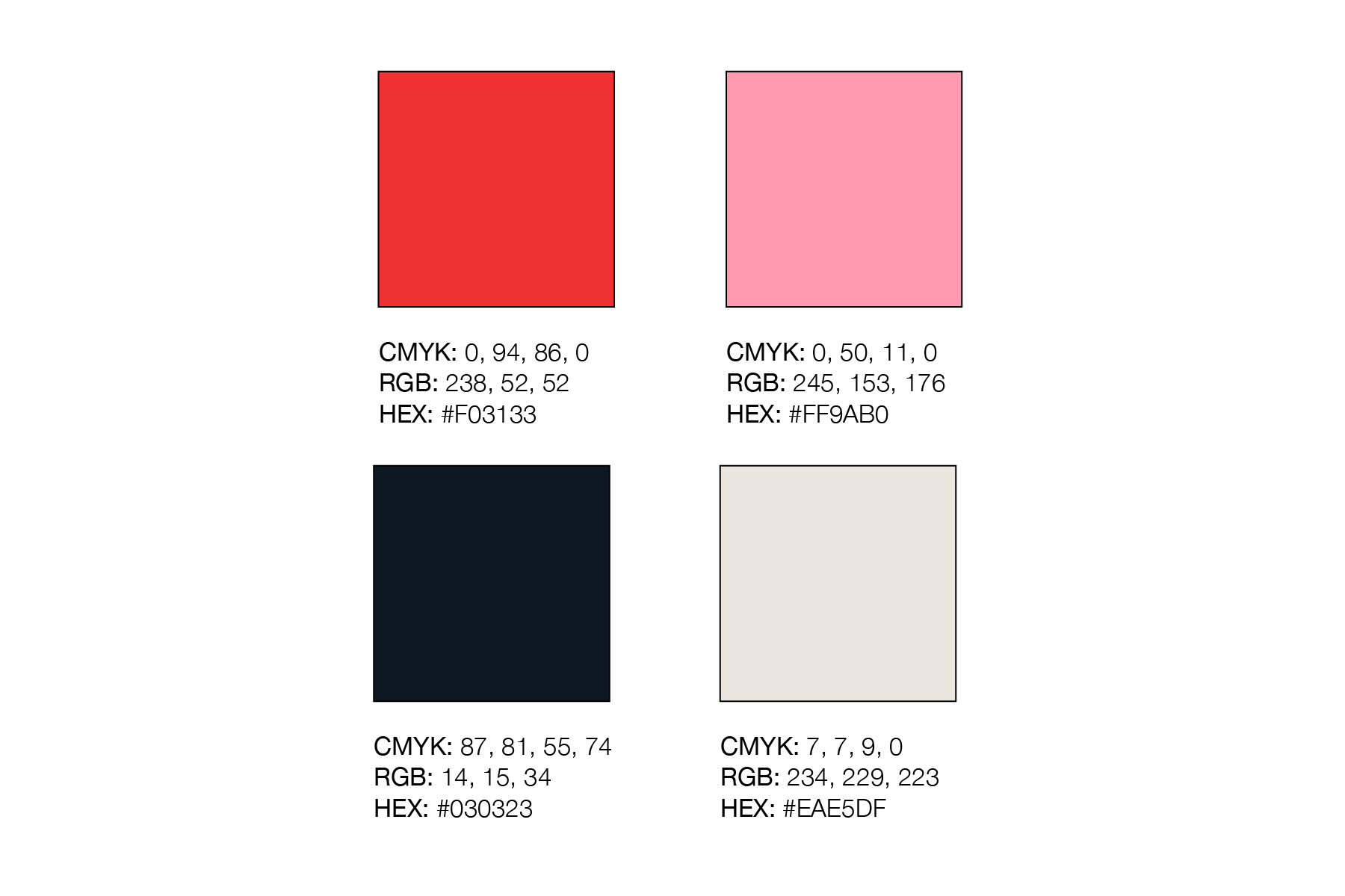
I wanted to keep the palette warm and welcoming, inspired by classic candy shops. Soft reds, creams, and a grounding navy make the brand feel timeless without feeling outdated. It’s sweet, but not “sugary-sweet”.
A Splash of Color
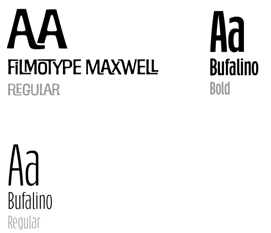
Filmotype Maxwell gives the brand its vintage personality, while Bufalino keeps everything readable and friendly. Together, they feel playful but still trustworthy.
Typography to Match
The old logo had personality, but it was stuck in the past and nearly 100 years old. It needed more balance and flexibility. the goal was to keep the nostalgia but give it room to grow.
The Old Logo
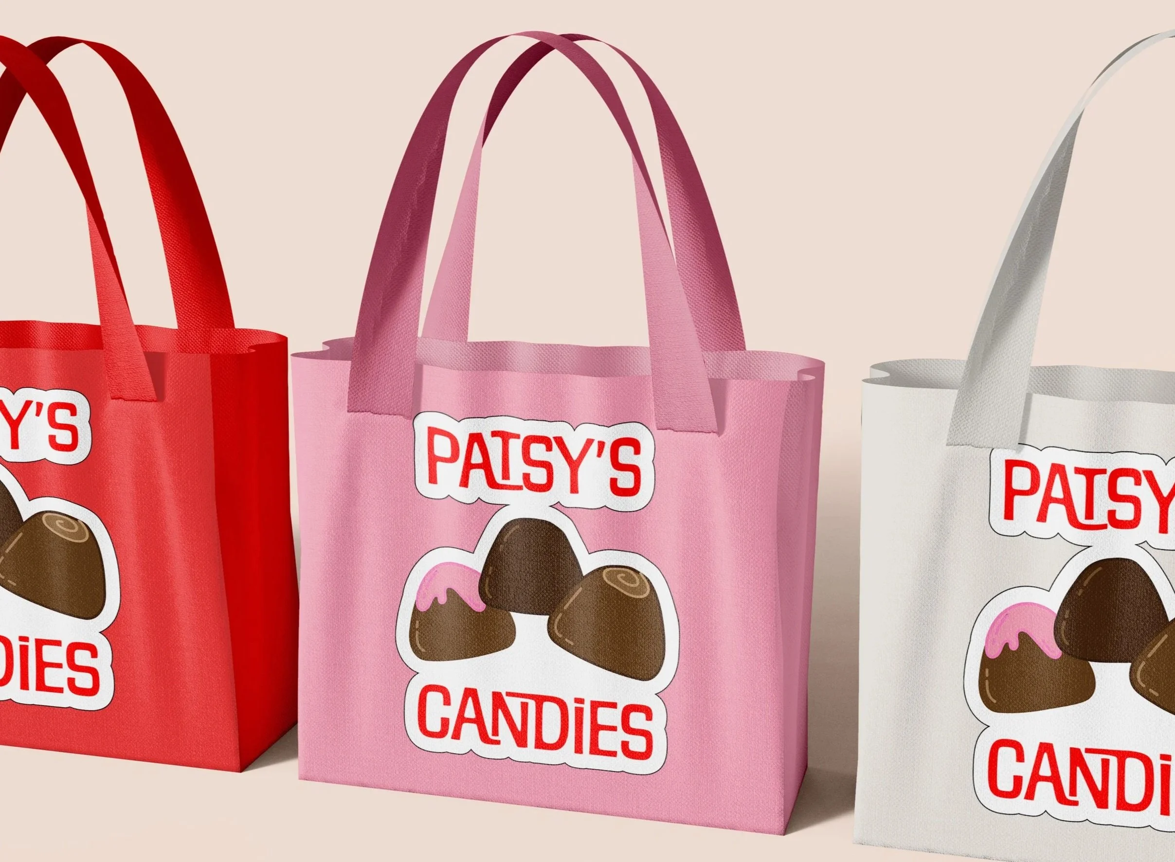
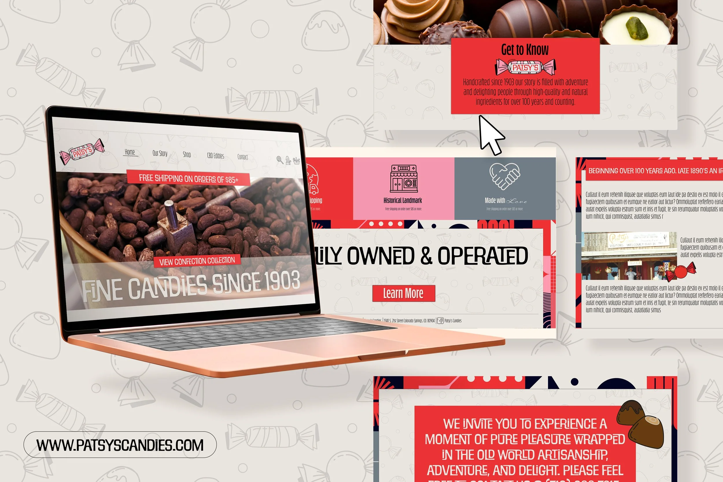
The new candy-shaped logo feels fresher and more adaptable while still honoring the original. It’s clean, fun, and works better across packaging and digital formats. Basically, it’s Patsy’s; but with a glow-up.
The New Logo
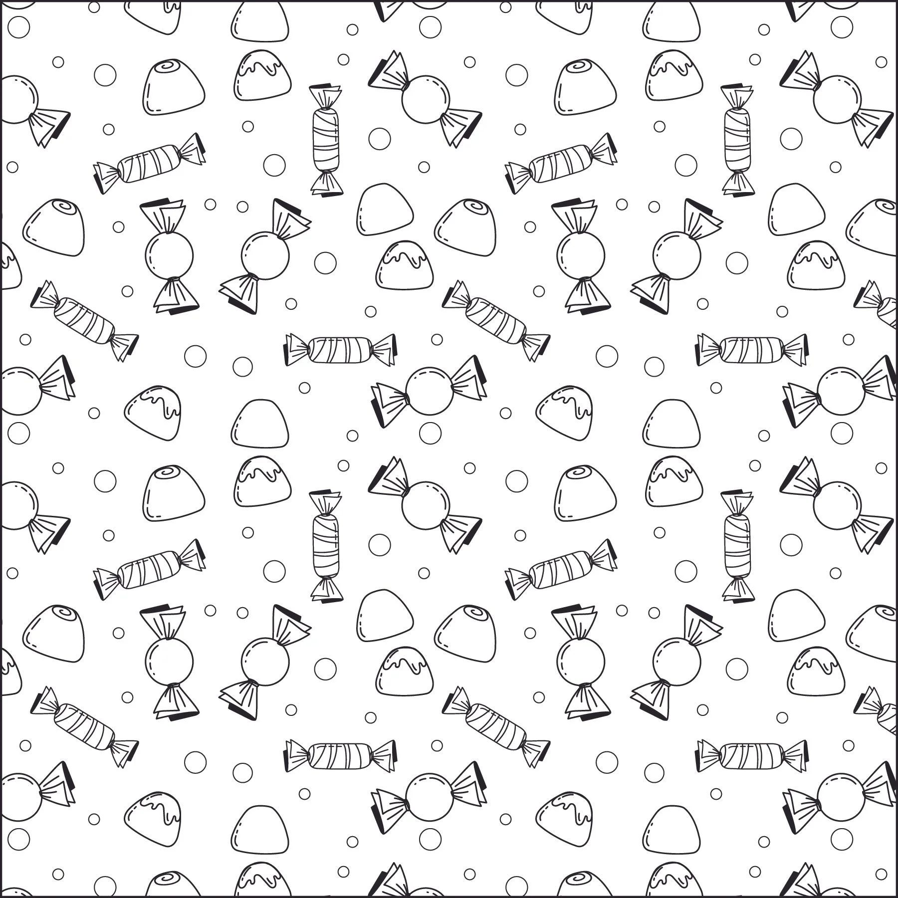
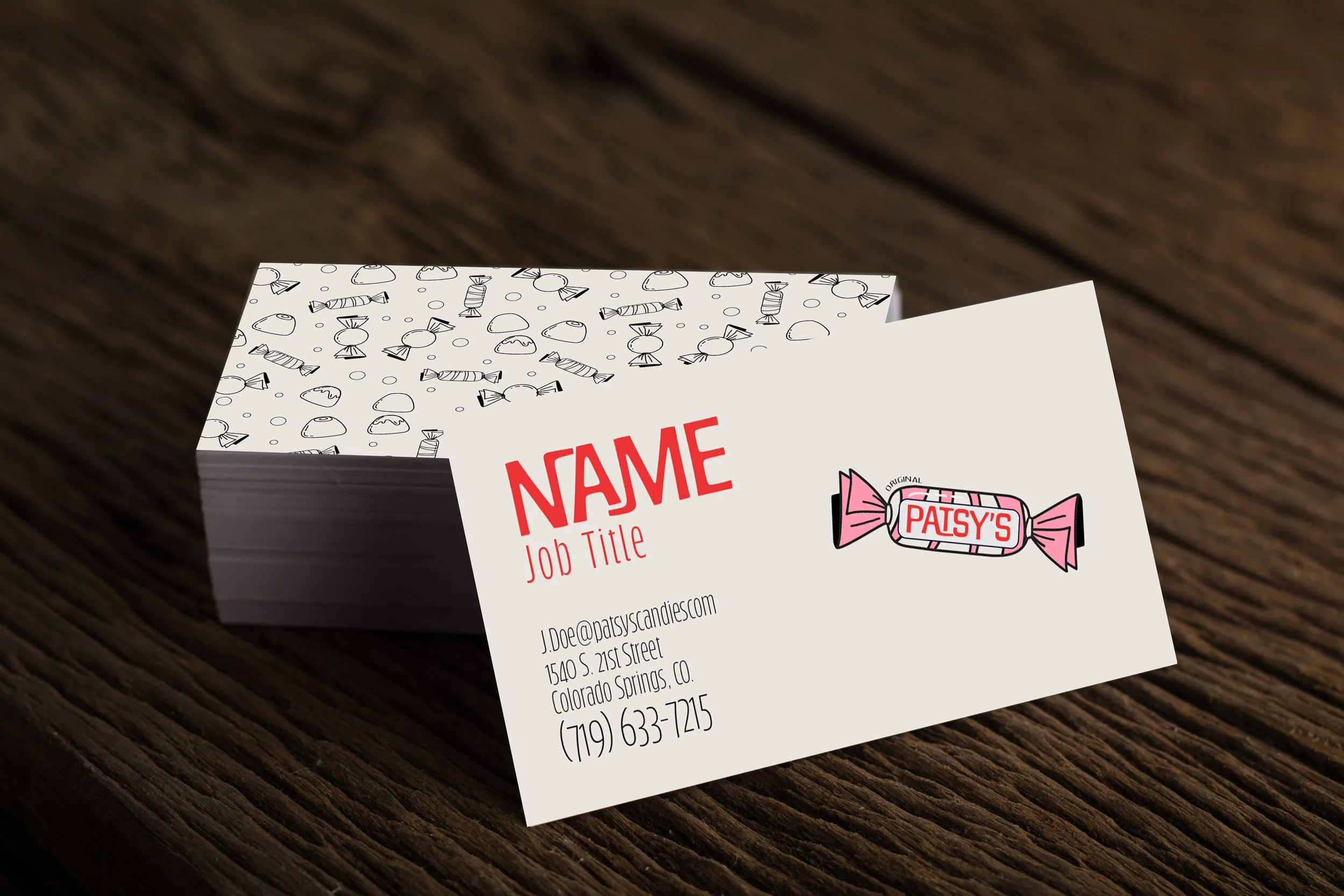
The pattern expands on the candy shapes, bring texture and playfulness to the brand. It’s subtle enough to use anywhere but still ties everything together. Think of it as the brand’s “secret ingredient”.
Complete it with a Pattern
The goal of this project was to refresh a historic candy brand without losing the nostalgia that makes it special. I wanted to modernize their visual identity while keeping the handmade, family-owned personality intact.
Project Intent
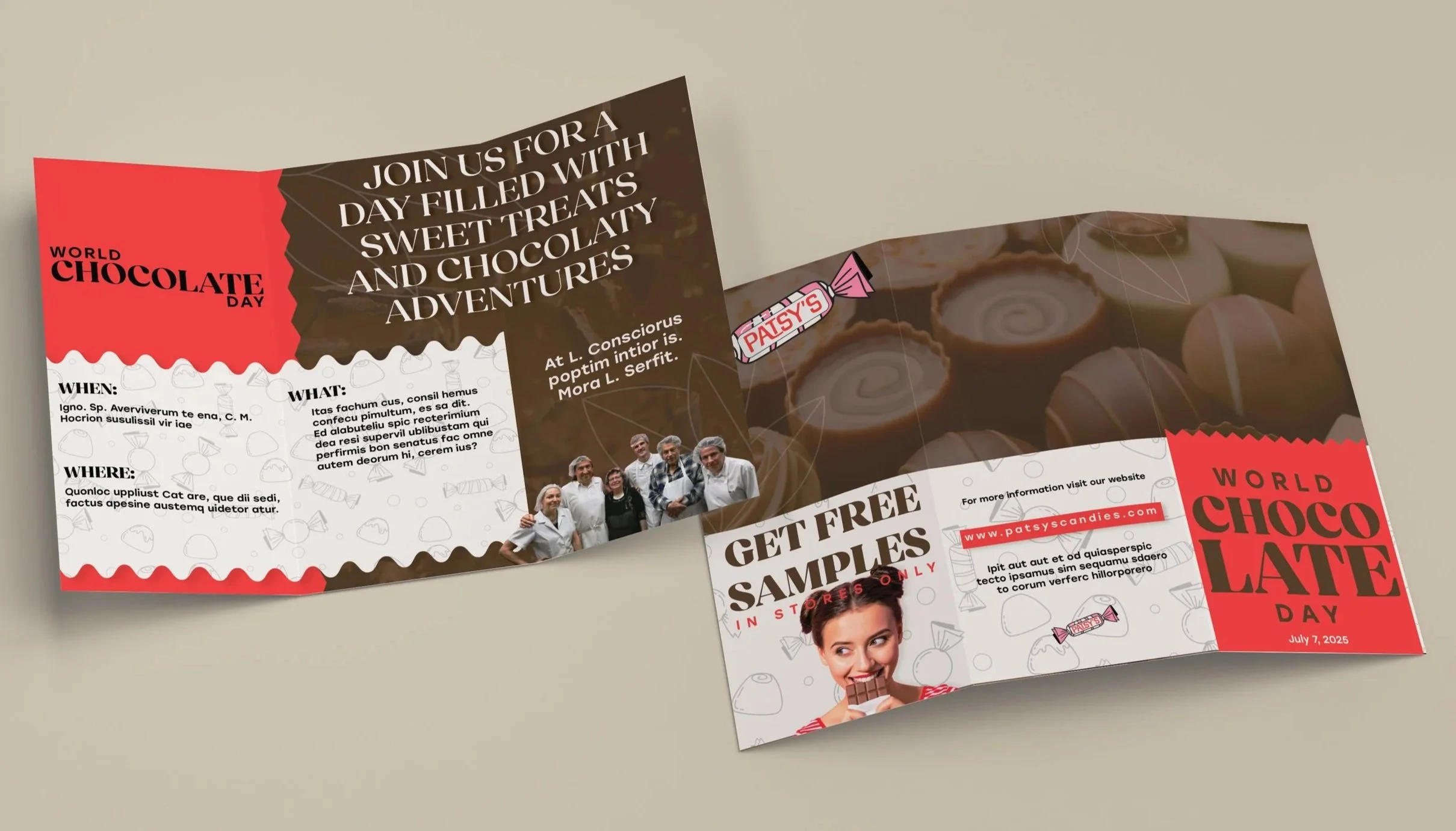
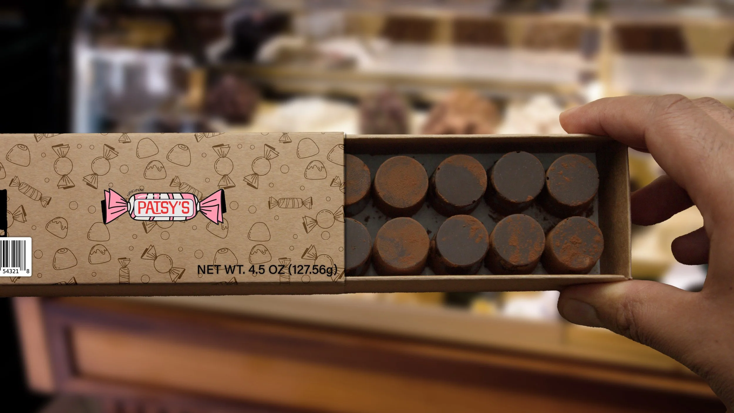
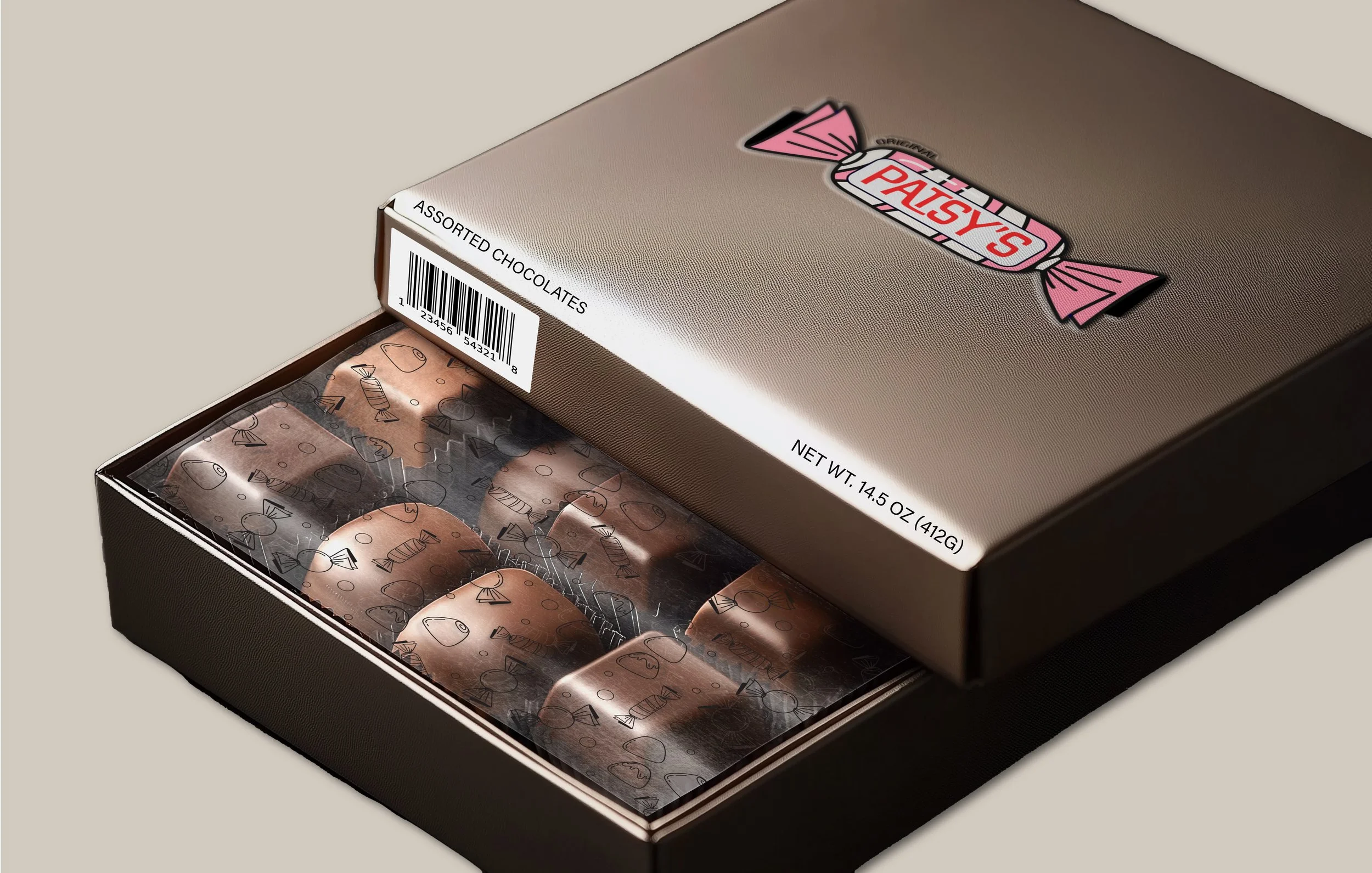
Packaging & Stationery

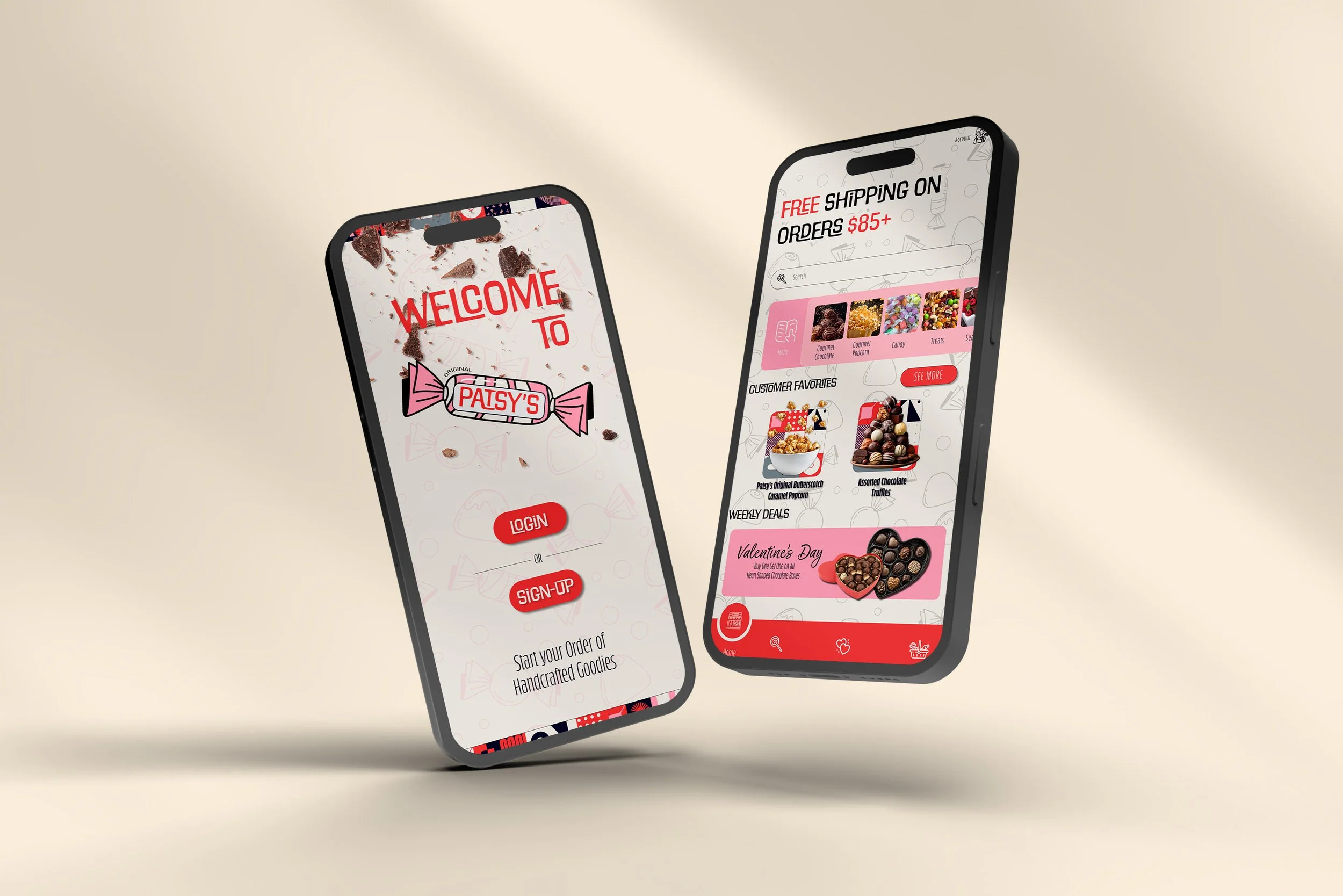
Website & Mobile App
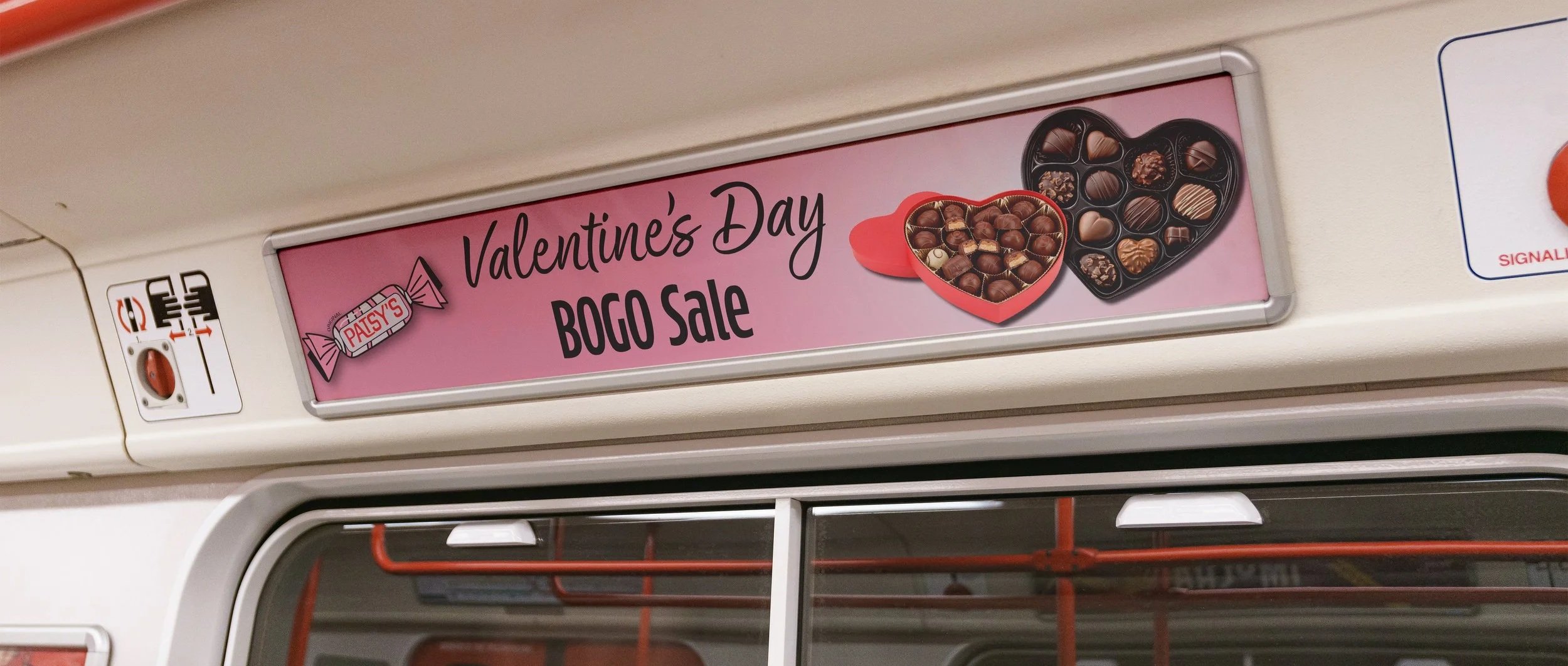
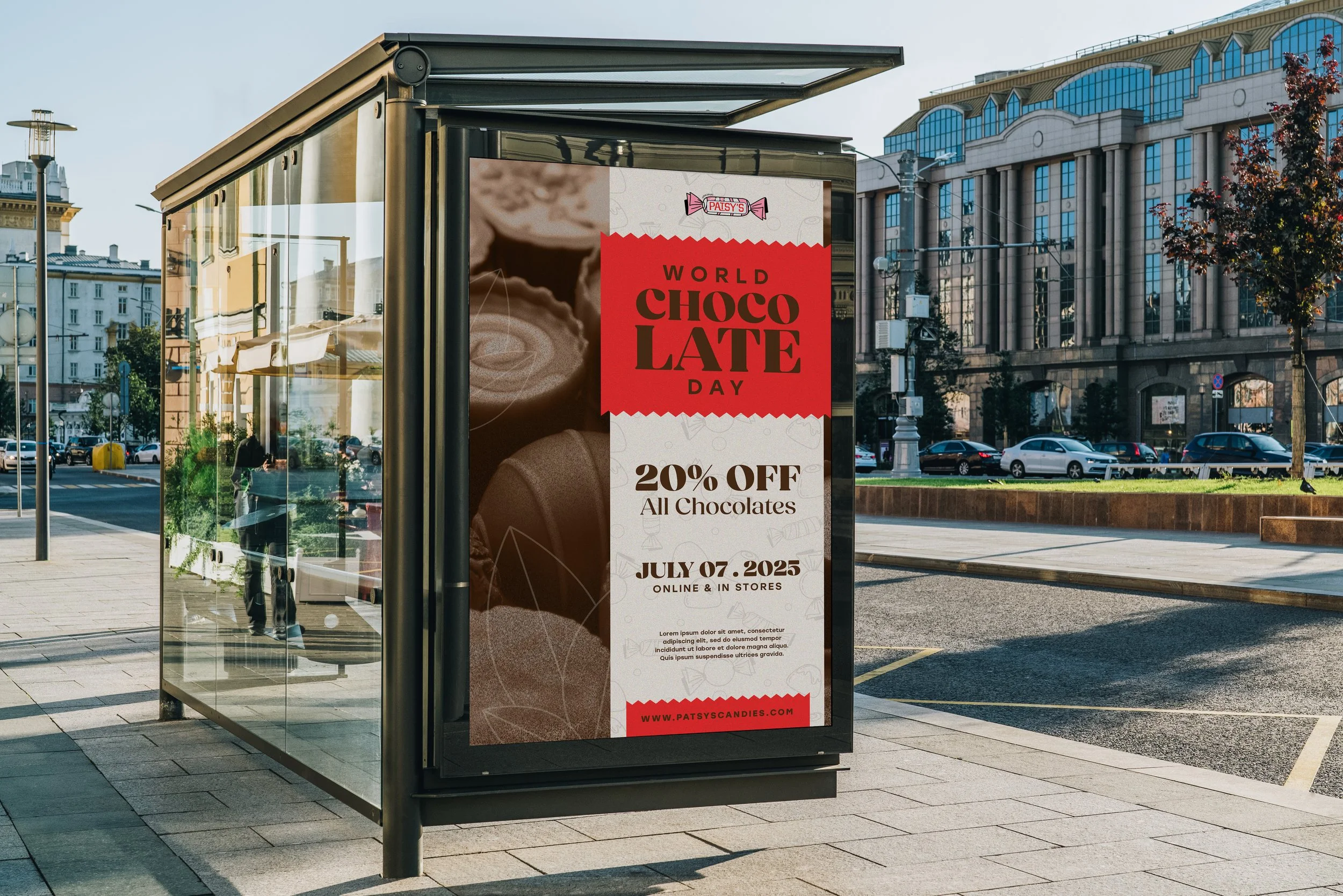
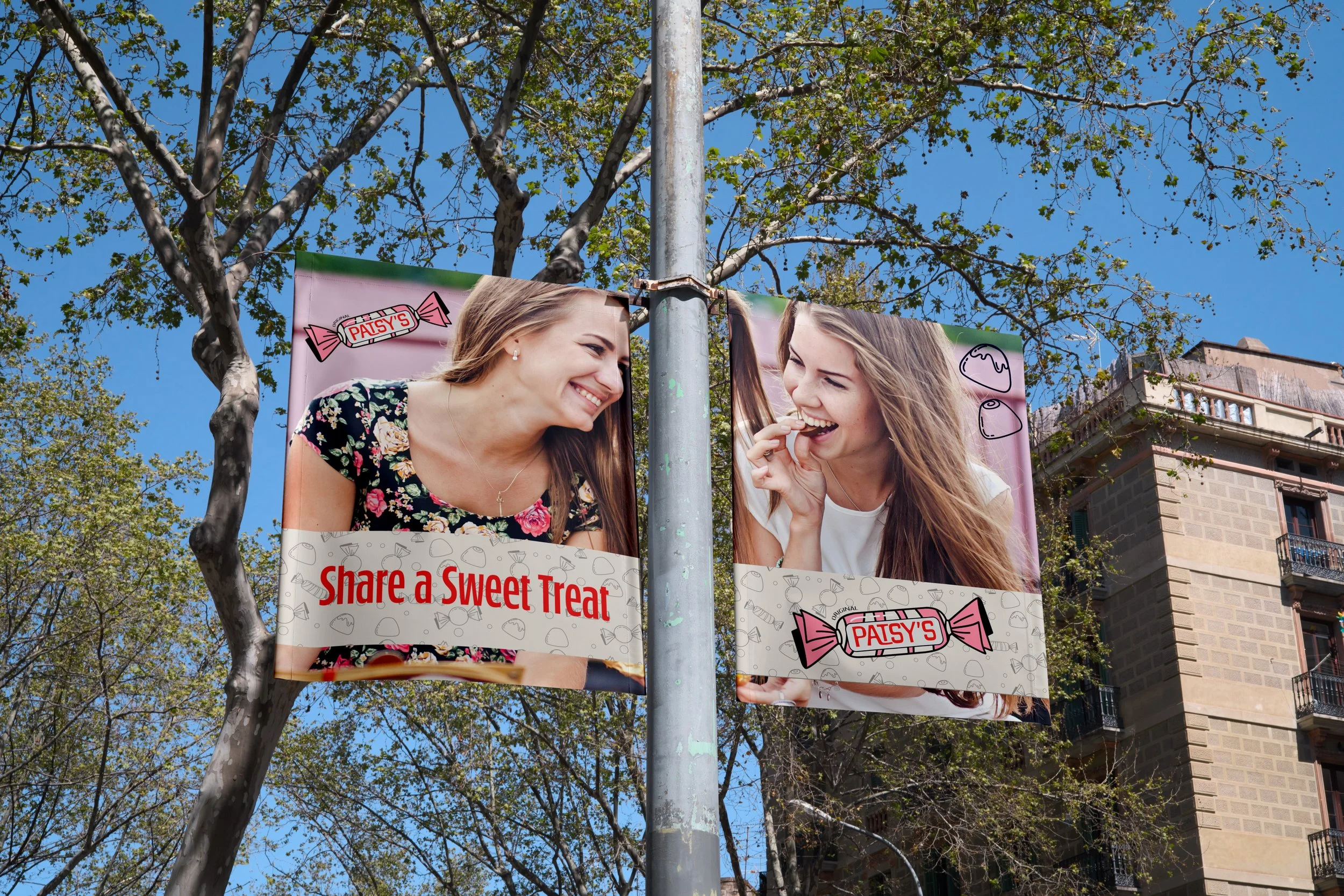
Environmental Contact