The Pikes Peak East Library is one of the most frequently visited and largest library branches in Colorado Springs, CO, serving diverse populations including families, students, seniors, and multilingual patrons. However, visitors often report difficulty finding their way around the space due to minimal signage, inconsistent labeling, and the complete absence of navigational maps. My goal was to create a wayfinding system that felt intuitive, modern, and built off this place of community.
Pikes Peak East Library
Programs
Illustrator, InDesign, & Photoshop
Project Type
Experience Design, Wayfinding Redesign
Purpose
Rocky Mountain College of Art + Design Course Project
Year
2025
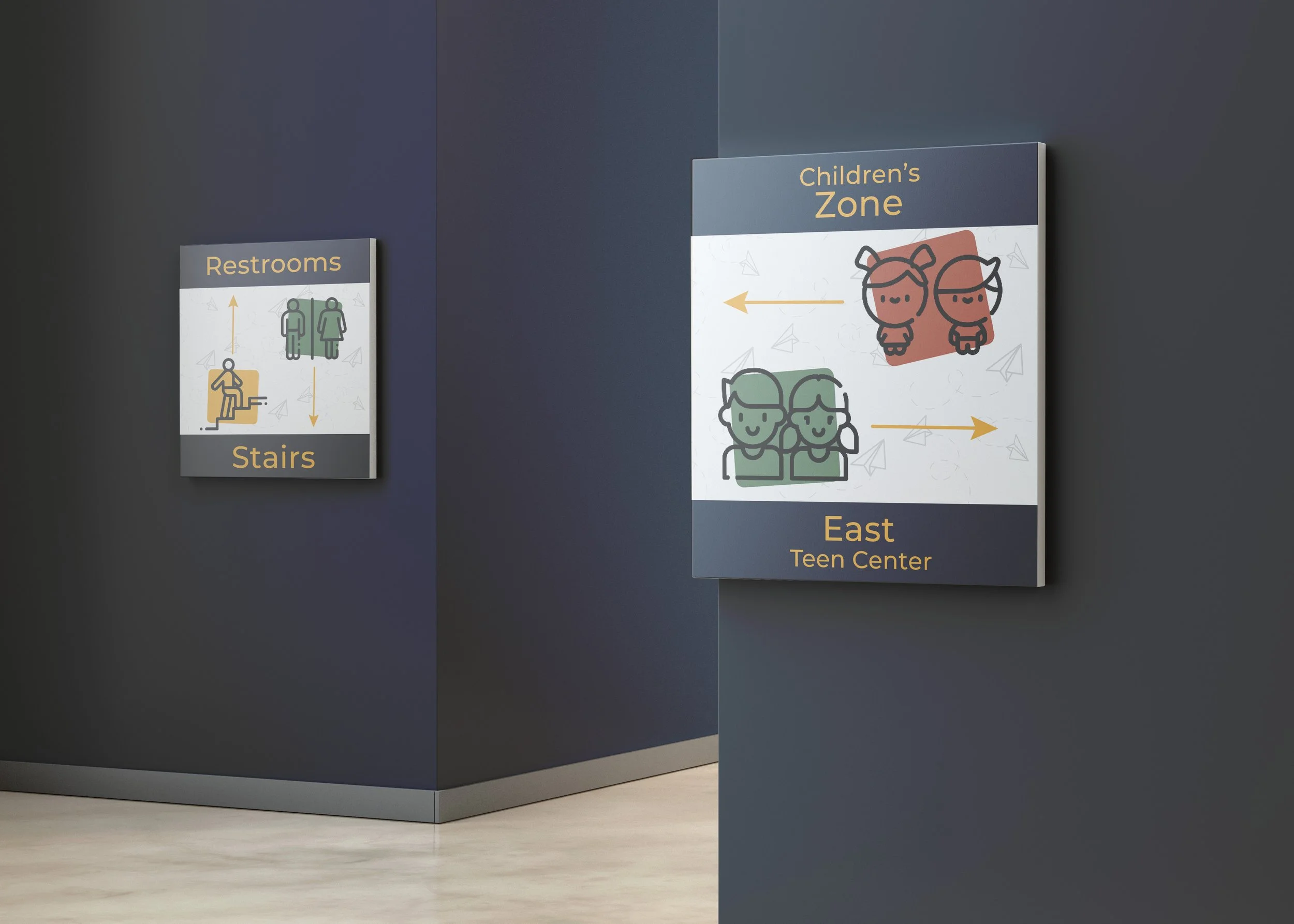
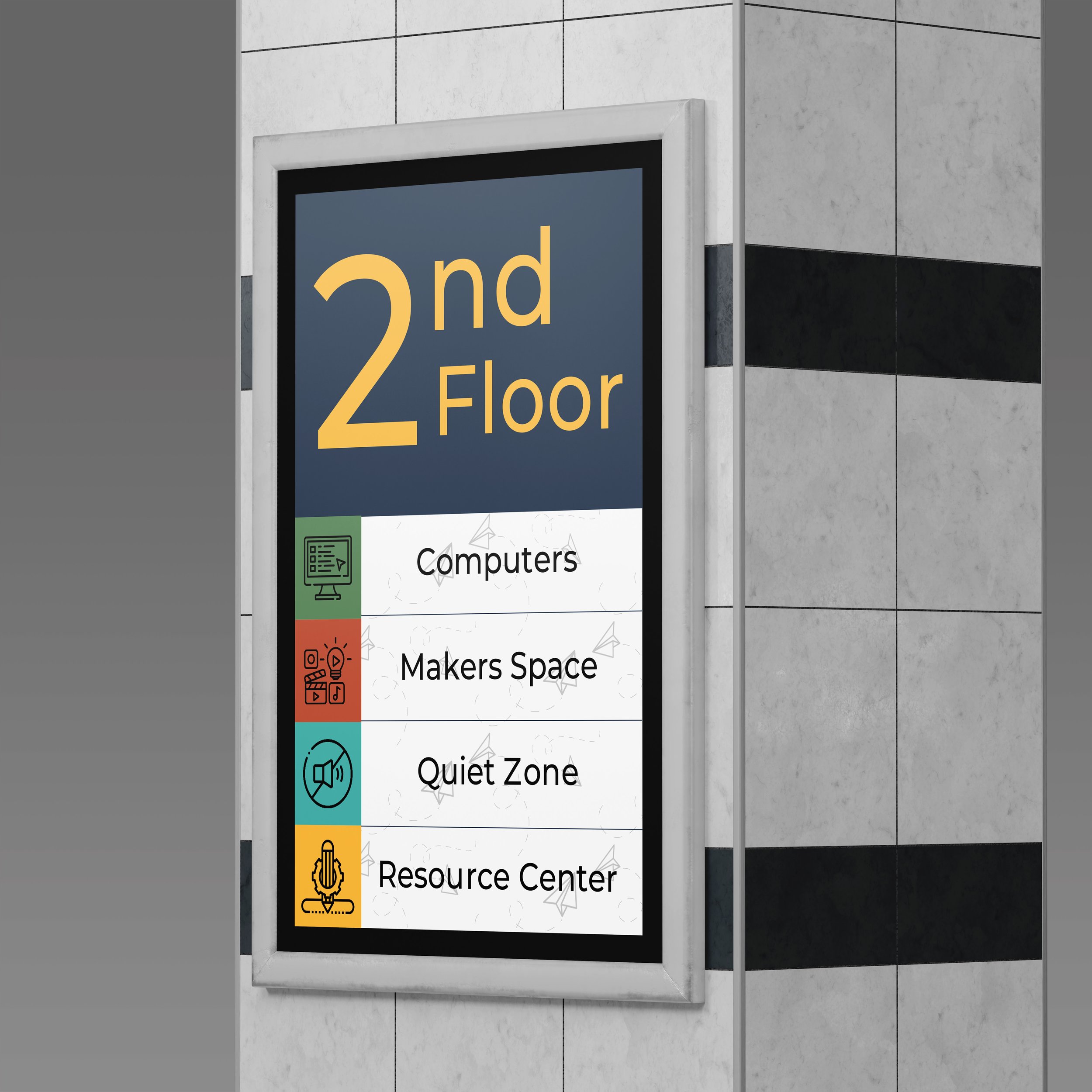
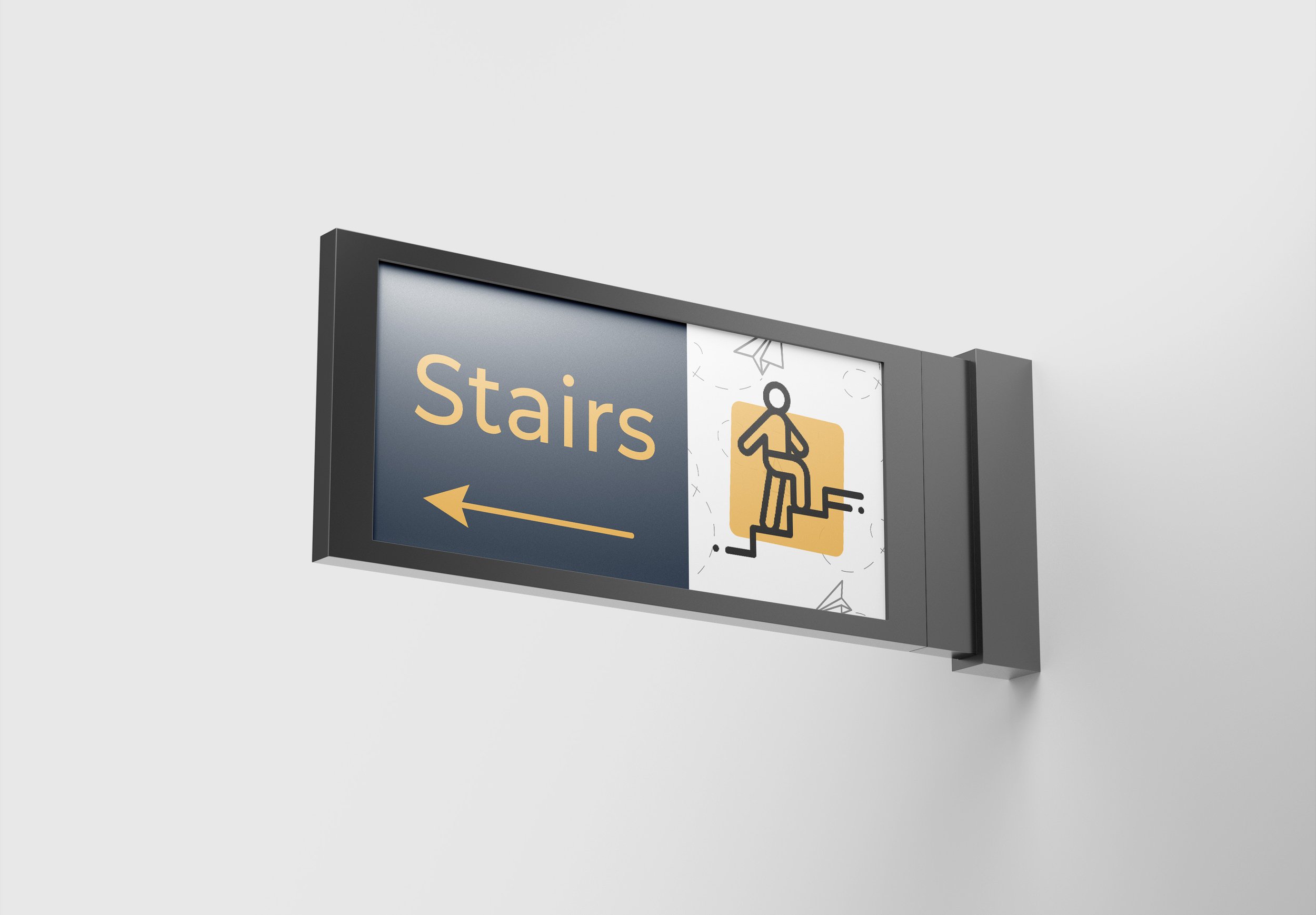
I started by sketching icons that felt friendly and easy to recognize at a glance. They act as the building blocks to a visual system that felt simple, clear, and very Colorado Springs.
It all Starts with a Sketch
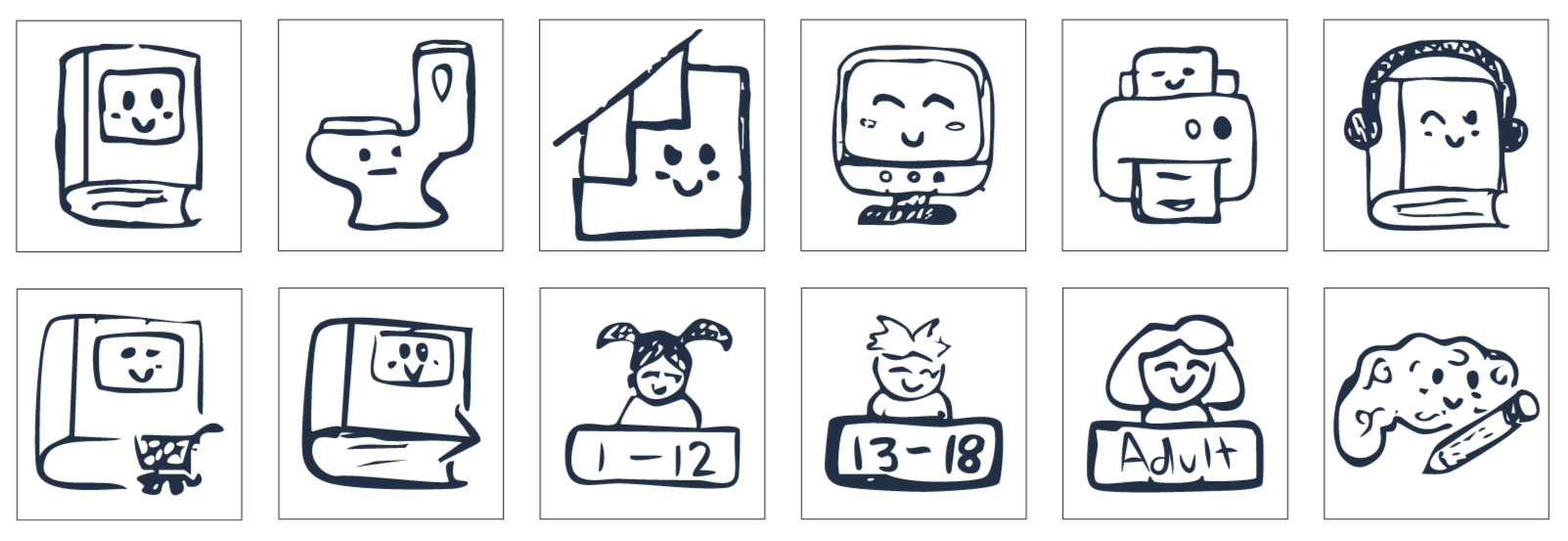
Once the sketches made sense, I digitized them and focused on clean lines and consistent styling. the updated icons are clear, more modern, and easier to use across multiple signs.
Then an Expansion of a Vision
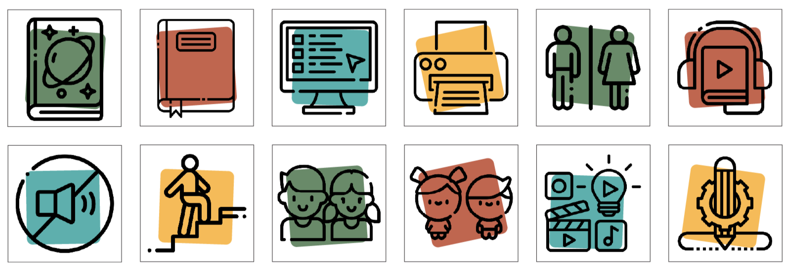
Final icons sourced from Flaticon.com with minor edits for cohesion by me!
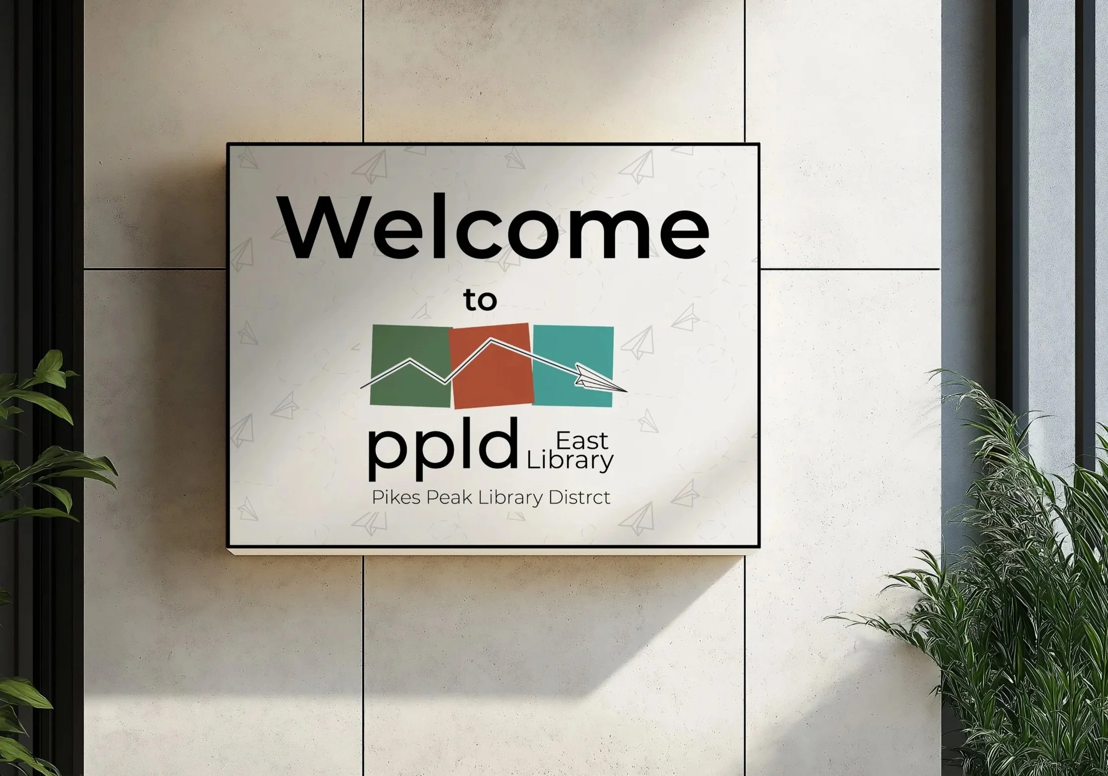
I puled colors from the Colorado landscape; grounded blues, soft greens, and warm golden tones. The palette feels welcoming without being overwhelming. It keeps the system modern, calm and easy for visitors to follow.
A Splash of Color

Montserrat handles the big, directional text with confidence, while Lato keeps the smaller details readable and friendly. Together, they feel clean and approachable without being boring. Basically, legibility with personality.
Typography to Match

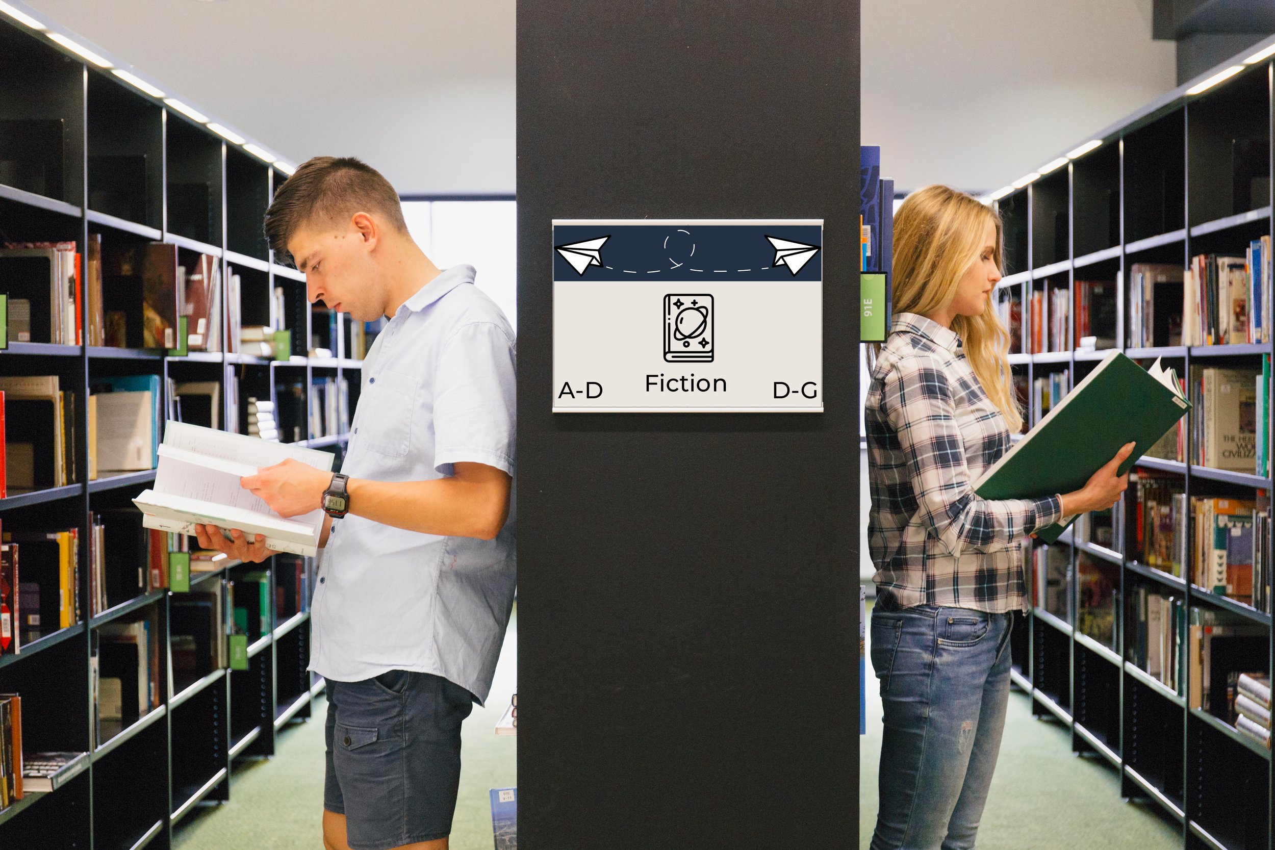
The old signage wasn’t terrible, it just wasn’t doing its job. It felt disjointed and a little too plain for a library that serves such a diverse community. It needed a system that actually guided people instead of making them guess.
Out With The Old
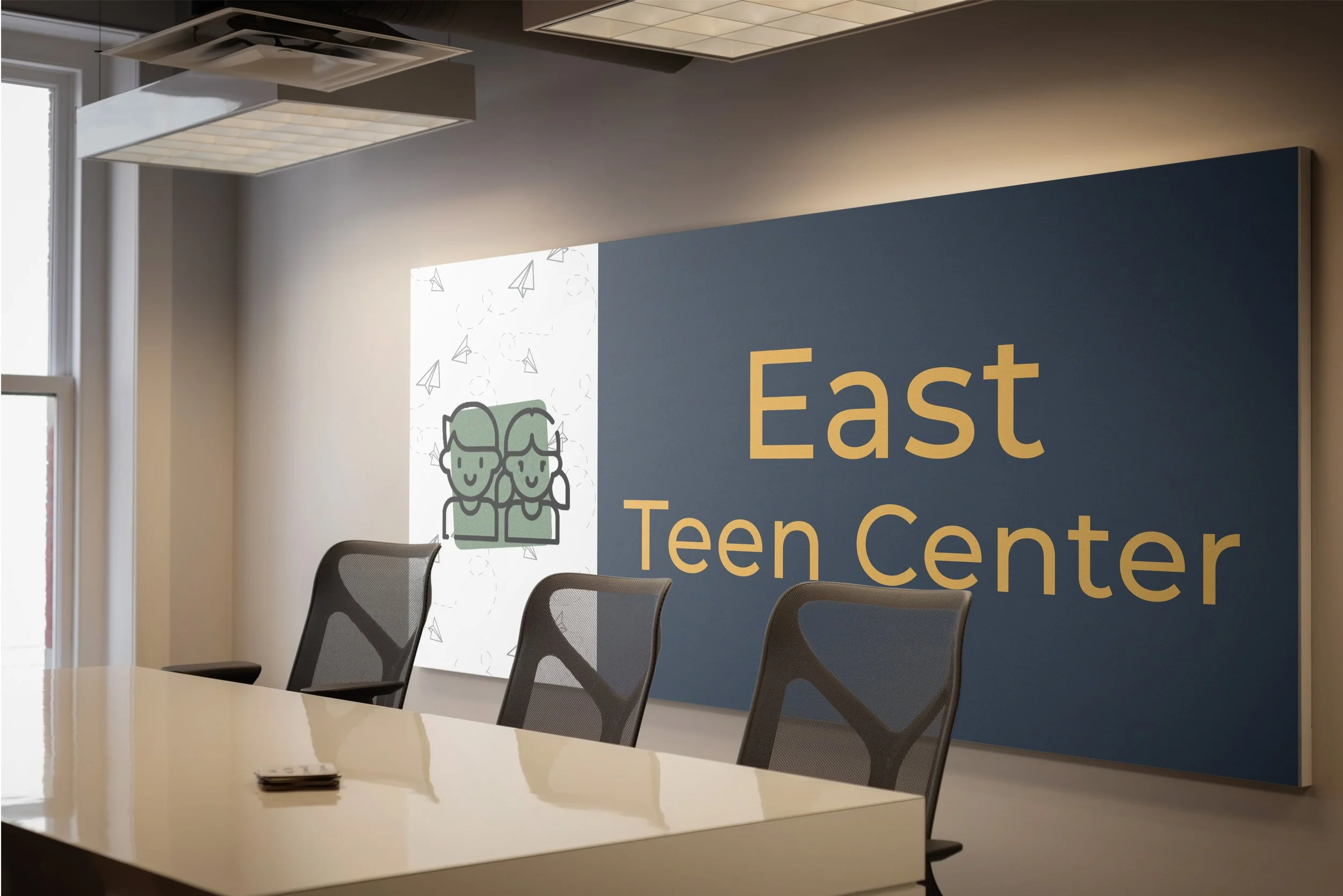
The new look is clearer, more consistent, and a lot more welcoming. The paper airplane gives the identity a fun local touch without being cheesy. It feel modern, but still community-centered.
In With The New

The pattern takes the paper airplane and turns it into something playful and dynamic. It adds personality to the signage without distracting from the information. It’s a subtle way to make the library feel more lively and connected.
Complete it with a Pattern
My intent was to create a wayfinding system that actually helps people; clear, friendly, and easy to follow. I wanted to design to feel modern and community-centered, with a subtle nod to the Air Force Academy through the paper airplane motif.
Project Intent
Environmental Contact