Personal Branding
My personal brand was built around who I am; calm, curious, and a little unconventional. I wanted my logo and colors to feel grounded yet creative, reflecting my approach to design, thoughtful, intuitive, and human. Every element represents balance, between structure and flow, chaos and calm, just like how I create.
Programs
Illustrator and InDesign
Project Type
Personal Brand Identity
Purpose
Rocky Mountain College of Art + Design Course Project
Year
2025
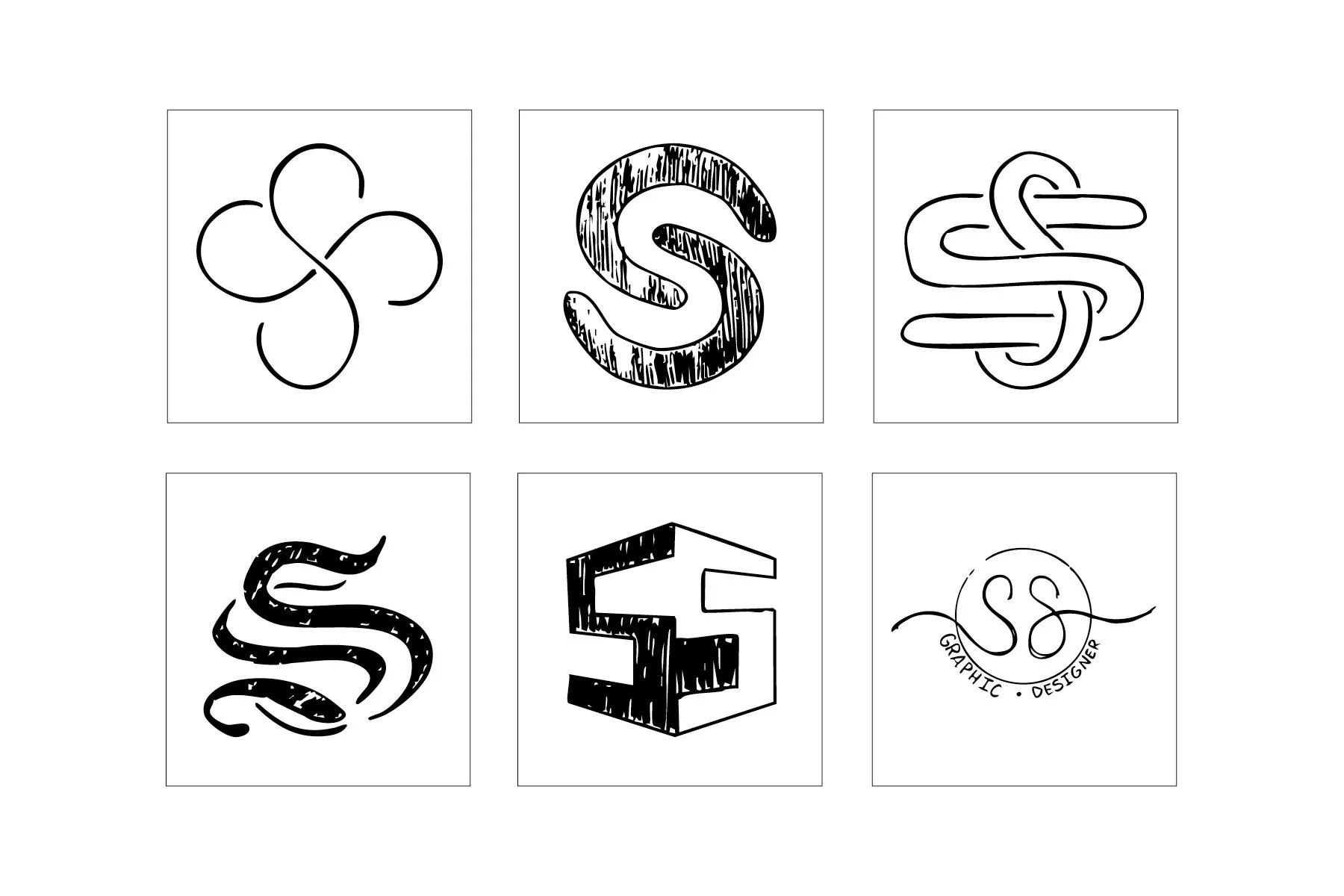
It all Starts with a Sketch
All my best ideas start as chaotic doodles, and this logo was no exception. I kept sketching until something finally felt like me.
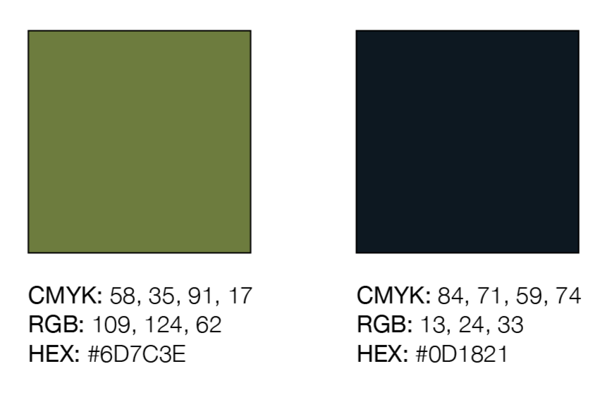
After surviving a neon-green childhood bedroom, I learned what not to do with color. So I chose grounded tones: An Earth green for growth and creativity, and a deep navy for calmness and structure. Together, they keep things balanced instead of chaotic.
A Splash of Color
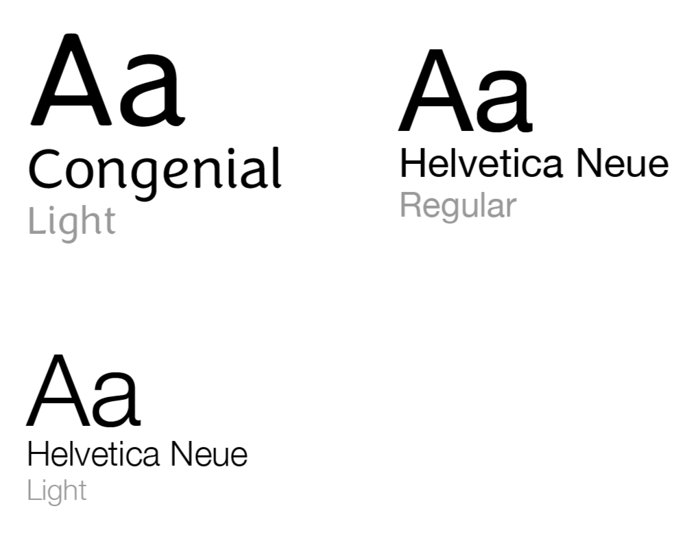
Helvetica Neue keeps everything clean and organized, while Congenial adds warmth and flow. It’s the same balance I try to bring to my work, structure with personality
Typography to Match
My brand is basically my personality in a visual form; calm, curious, and slightly unconventional. Each concept played with movement and balance to reflect how I work.
Then an Expansion of a Vision
Between structure and flow, chaos and calm, creativity and intention, the final design says it all. The looping form feels both organic and precise, echoing the rhythm of my design process.
Final Logo
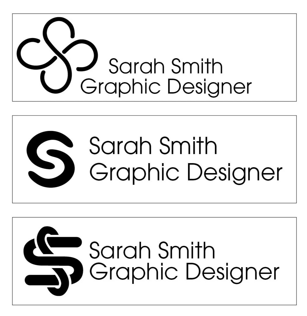
Logo Lockups
Favicons
Dark Mode
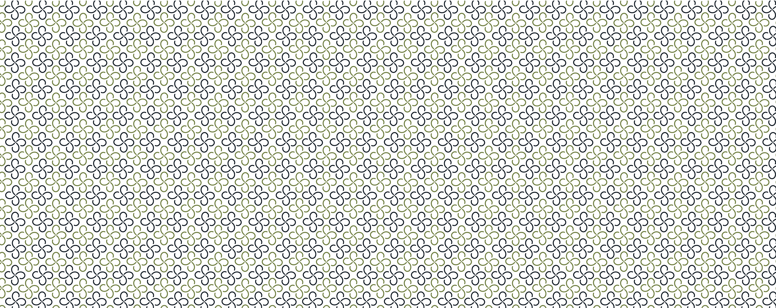
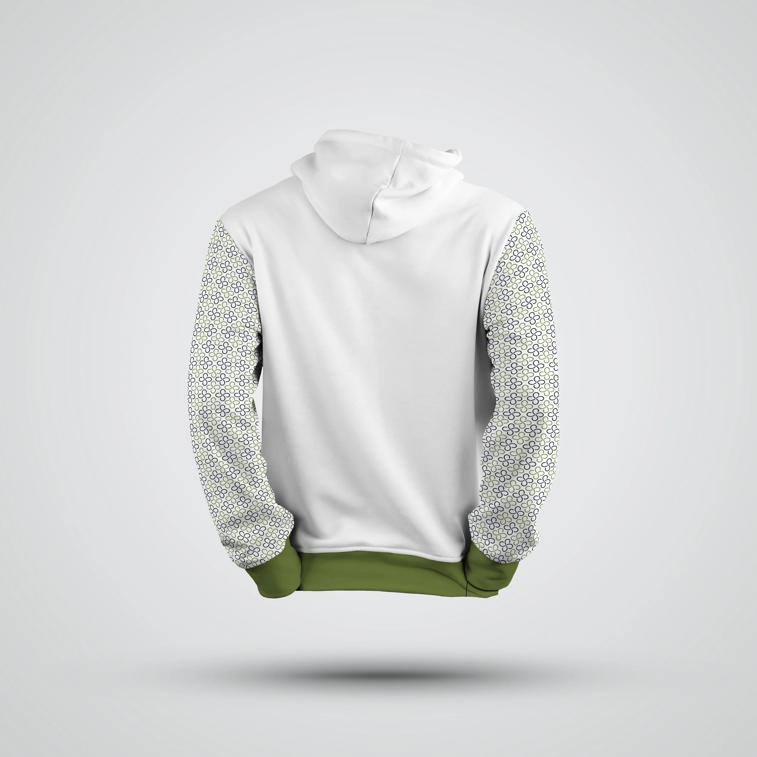
Patterns have the power to bring an identity to life. A repeating motif from core shapes, transforms my logo into texture that symbolizes connection and continuity. Representing how creativity flows, this pattern can extend across print, packaging, and digital spaces.
Complete it with a Pattern
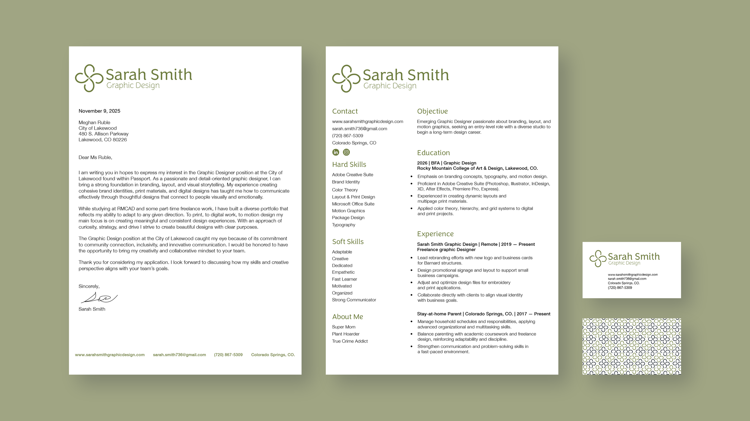
My intent was to build a brand identity that genuinely reflects who I am as a designer; calm, curious, grounded, and a little unconventional. I wanted a system that felt personal but still clean and professional.

