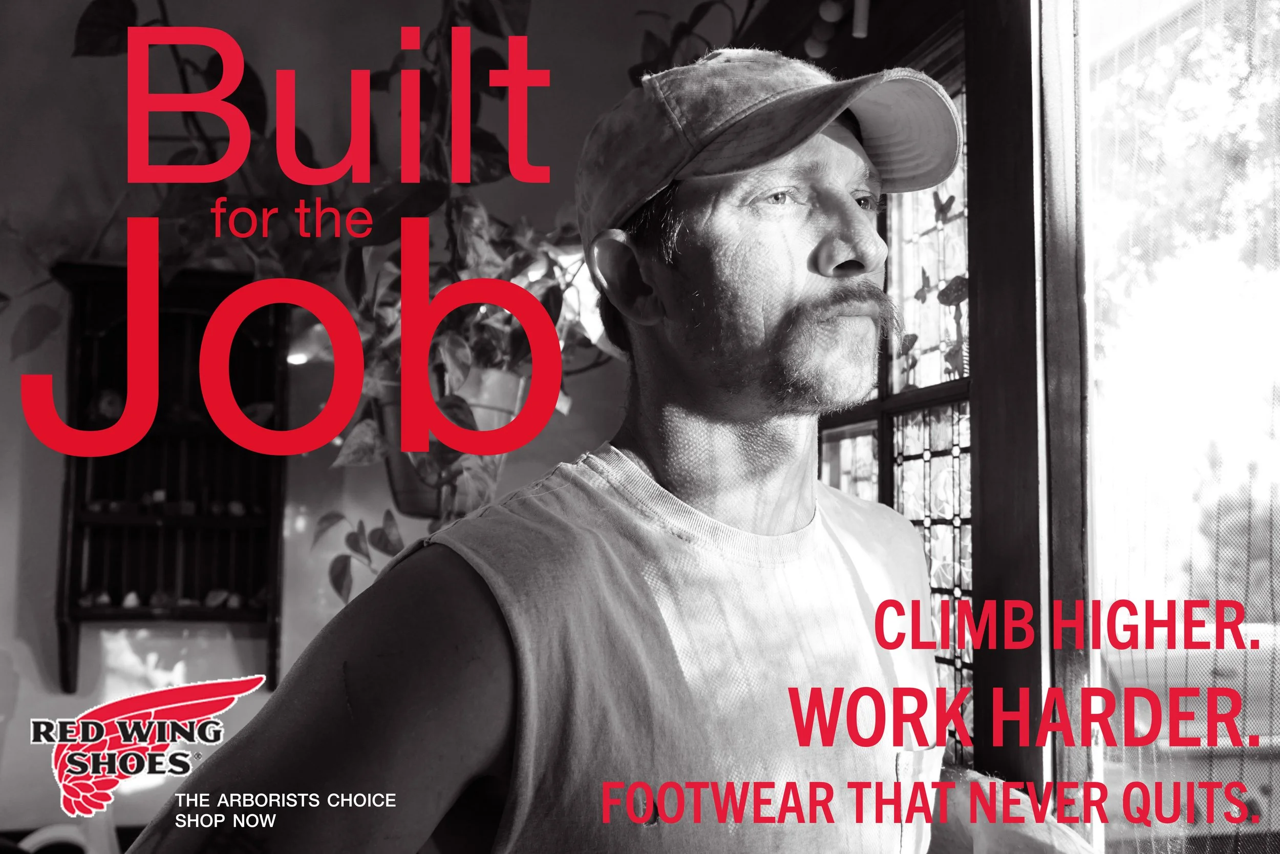
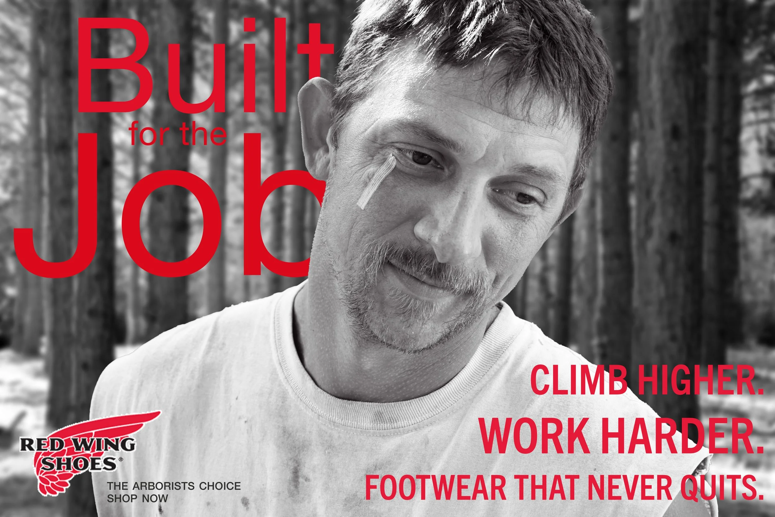
This ad campaign celebrates strength, craftsmanship, endurance, and the everyday blue collar worker (one of Red Wing Shoes core values). Each design showcases a harder worker ready to face the day and the pride found in a well-worn tool.
Red Wing Shoes Co.
All images are shot and edited by me, unless stated.
Programs
Illustrator, InDesign, Lightroom, Photoshop, & Sony a6000 Camera
Project Type
Photography Advertisement Campaign
Purpose
Rocky Mountain College of Art + Design Course Project
Year
2025
Red Wing Shoes is all about authenticity, durability, and honest craftsmanship. They make boots that outlast trends and pretty much anything else. That attitude shaped the tone of the entire campaign.
Company Attributes
Strategy + Goals
The goal was to honor Red Wing’s legacy while appealing to a newer audience that values story and grit. No fluff; just real workers and real wear.
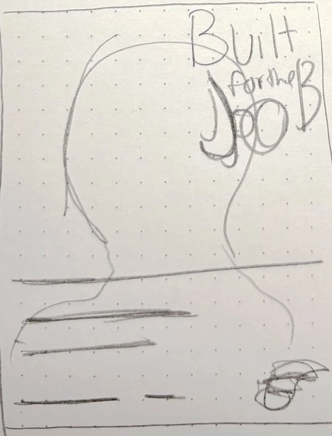
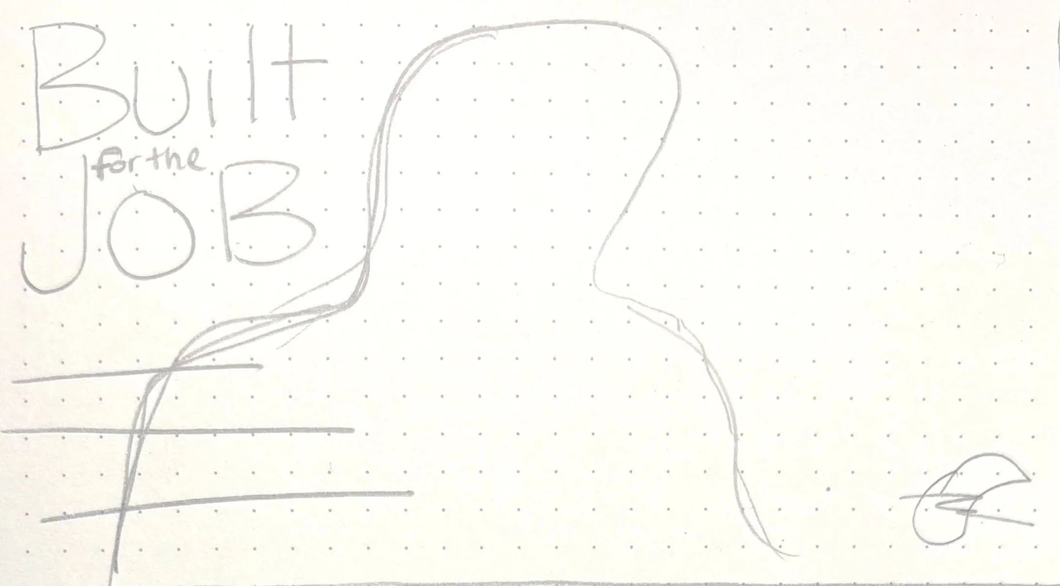
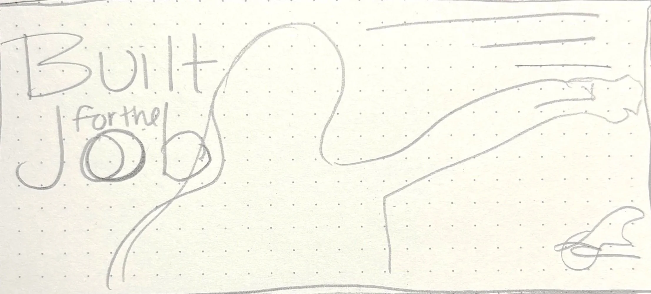
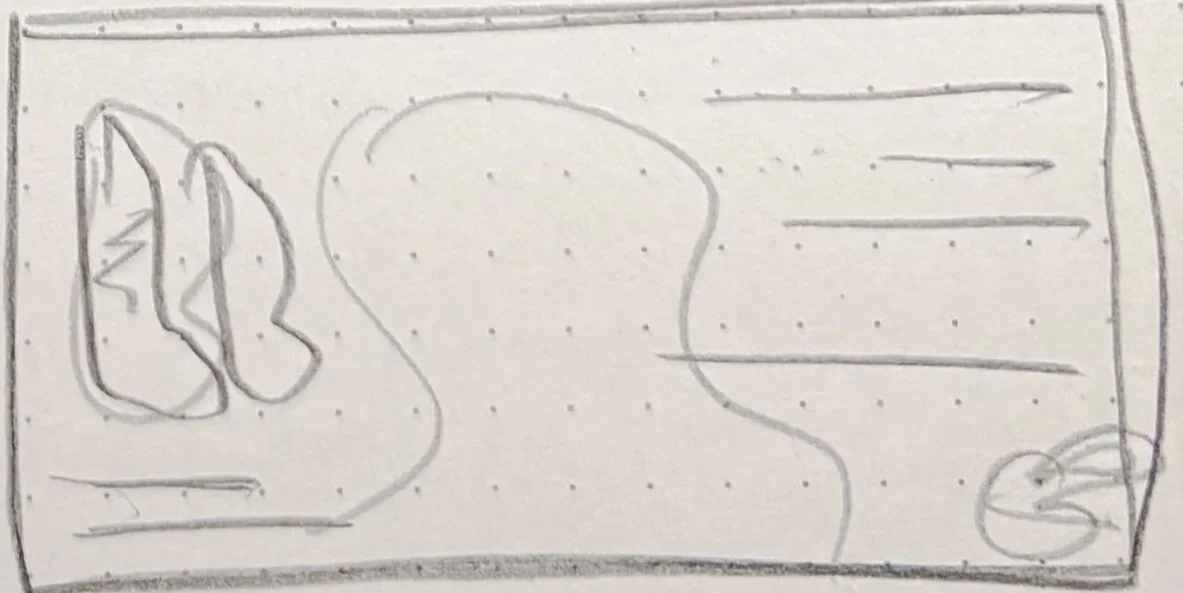
These rough sketches pulled inspiration from vintage trade ads and classic Americana Layouts. I played with bold type, rugged textures, and strong portrait placement. These ideas helped me find a visual direction that felt both timeless and fresh.
Sketches

I stuck with Red Wing’s iconic red, but also pair it with bold black and whites. The palette reinforces the brand’s no-nonsense personality. It feels tough without trying too hard.
Color

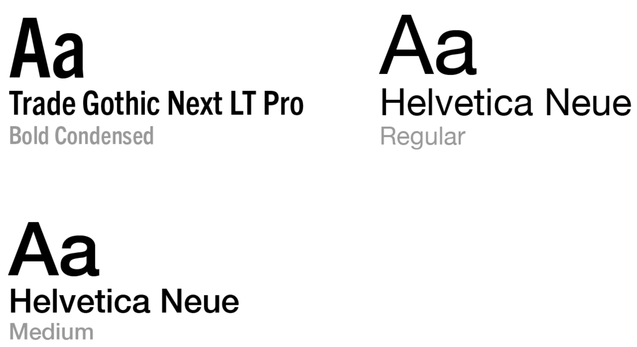
Trade Gothic Next brings that industrial, hardworking edge, while Helvetica Neue keeps everything clean and readable. Together, they say exactly what Red Wing’s stands for: Strong, honest, and built to last.
Typography
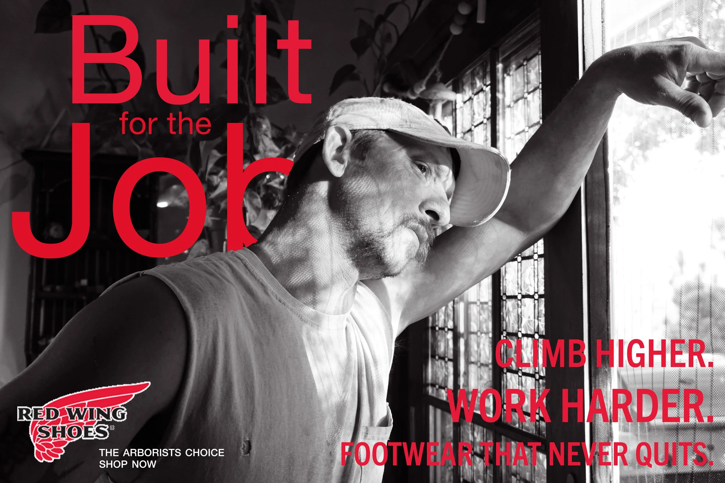
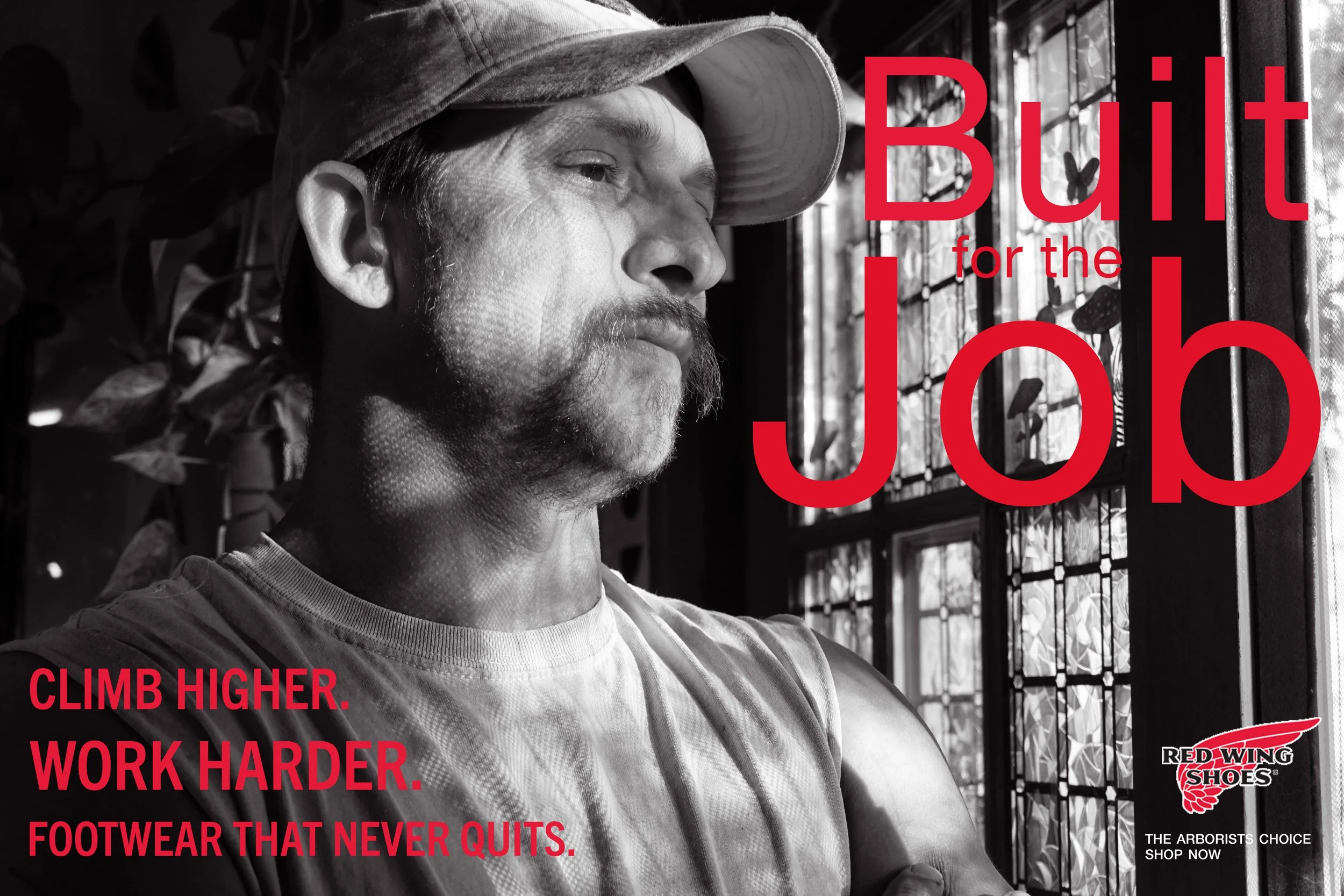
The first direction leaned heavily into bold visuals. It highlighted the physical toughness of the boots and the workers who wear them. Strong, but maybe a little too intense for a full campaign.
First Ideation
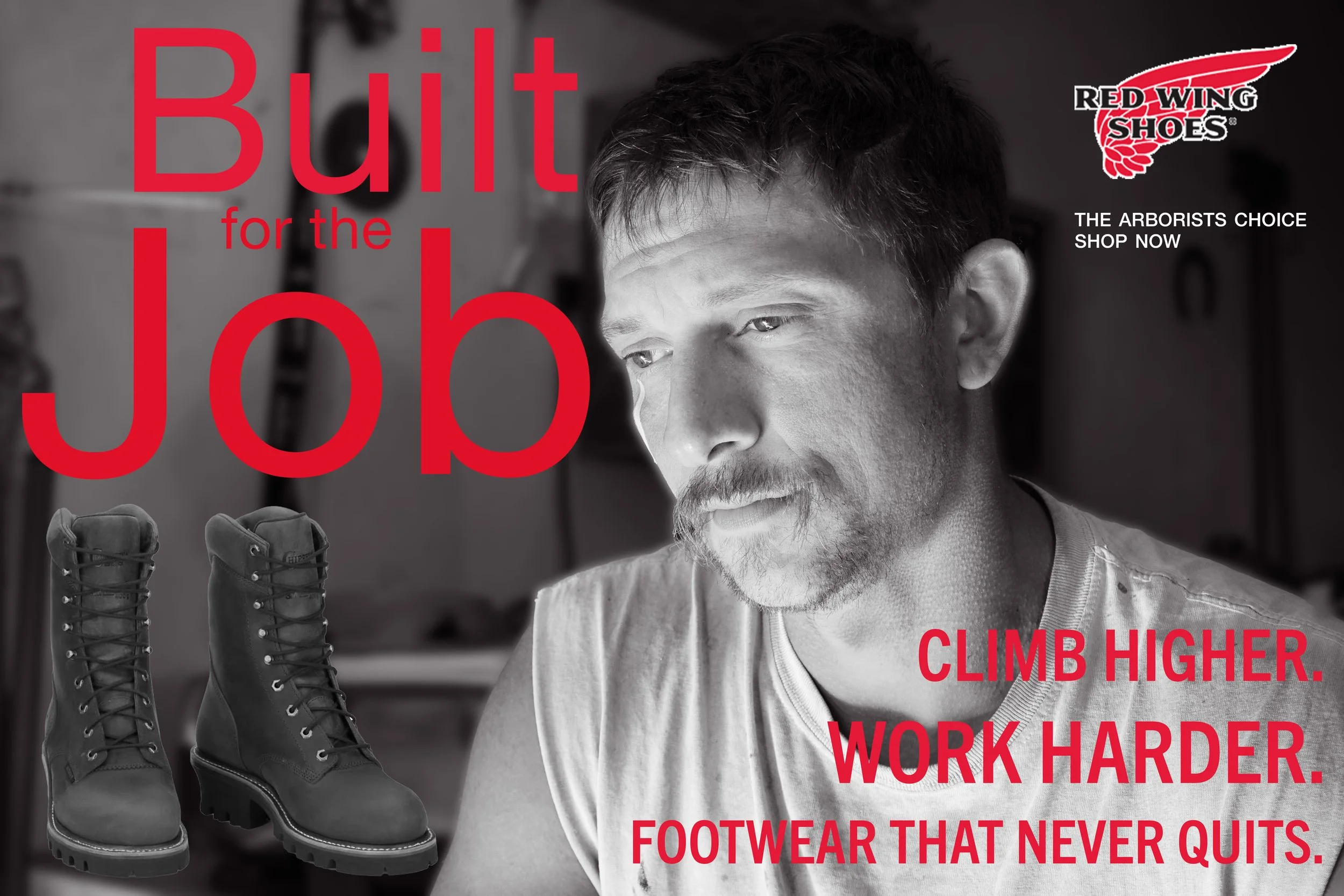


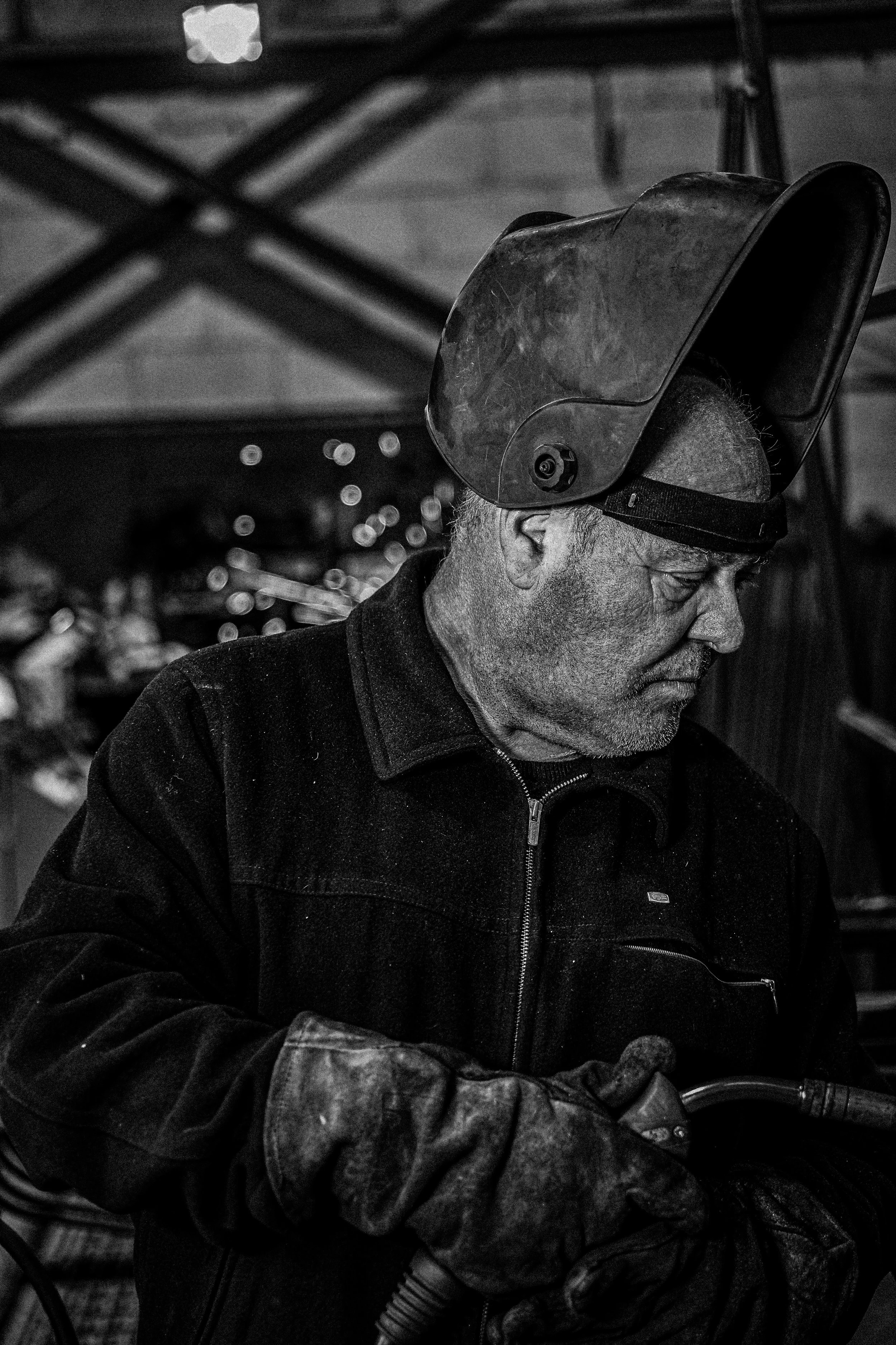
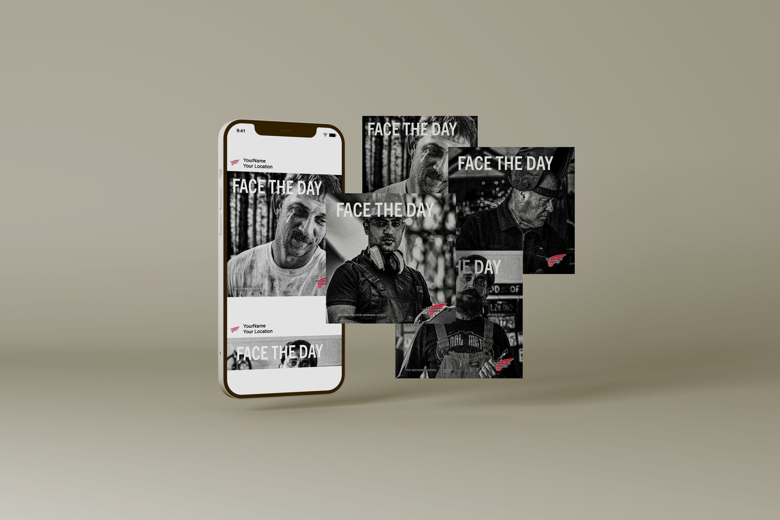
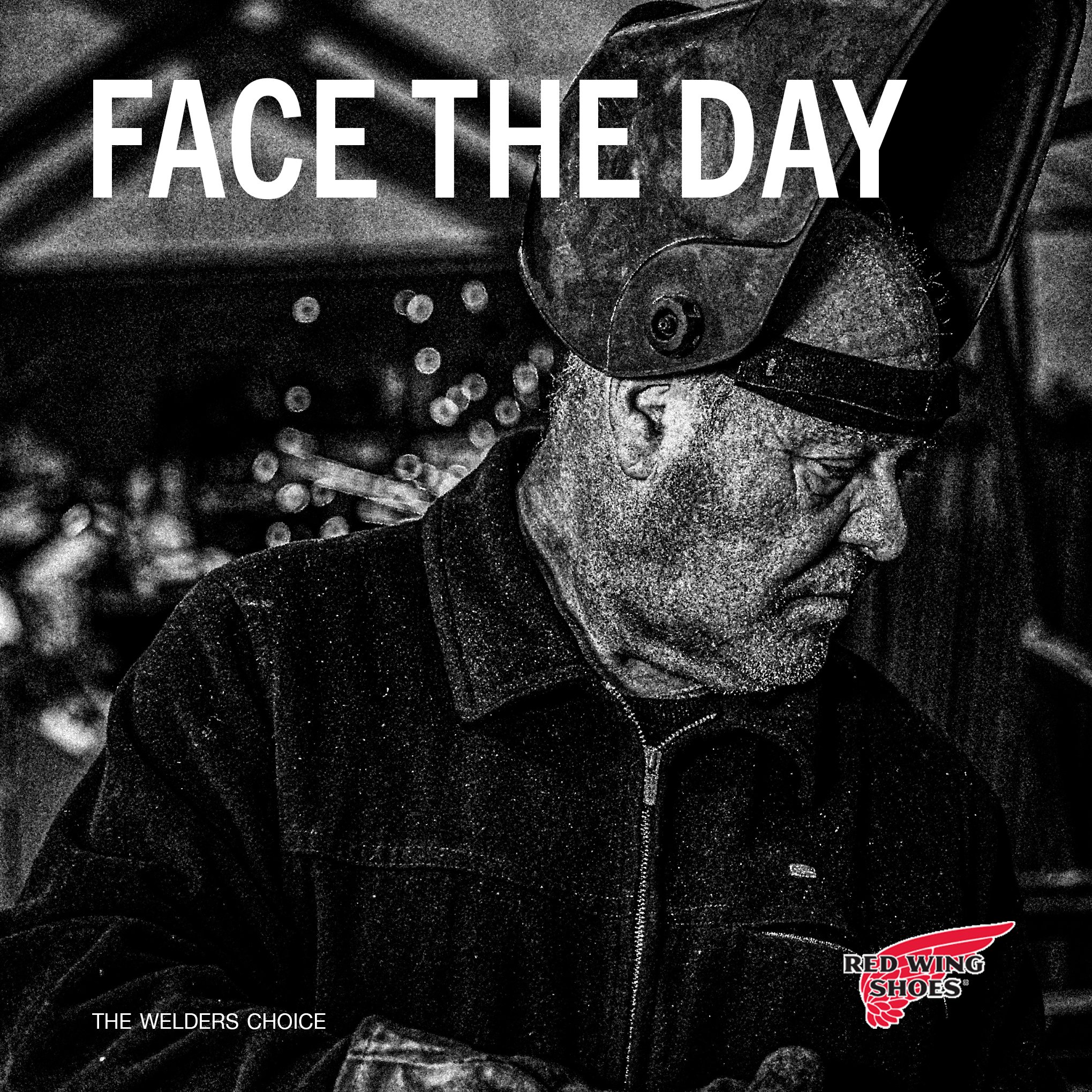
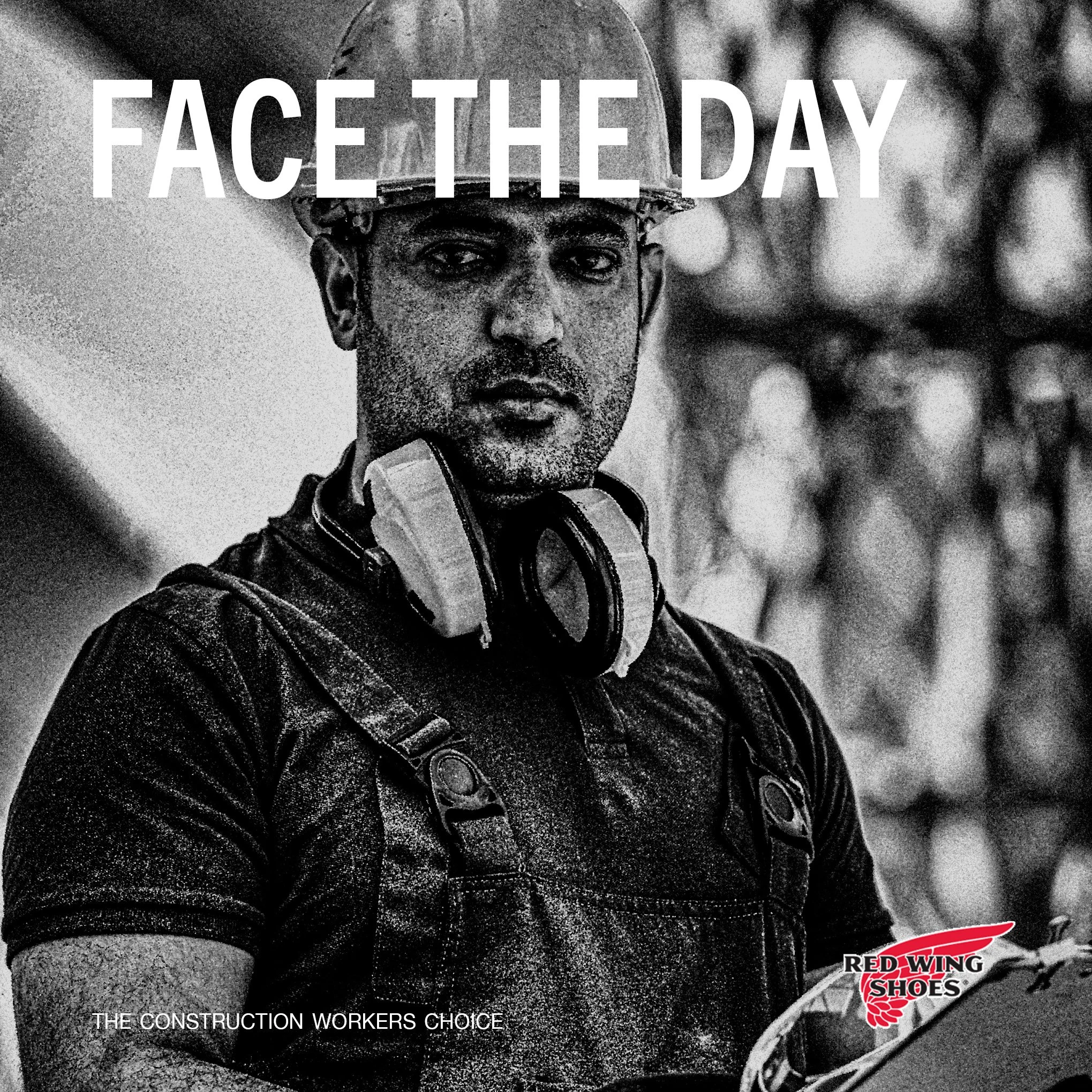
Construction worker, welder, and mechanic images sourced from Pexels.com
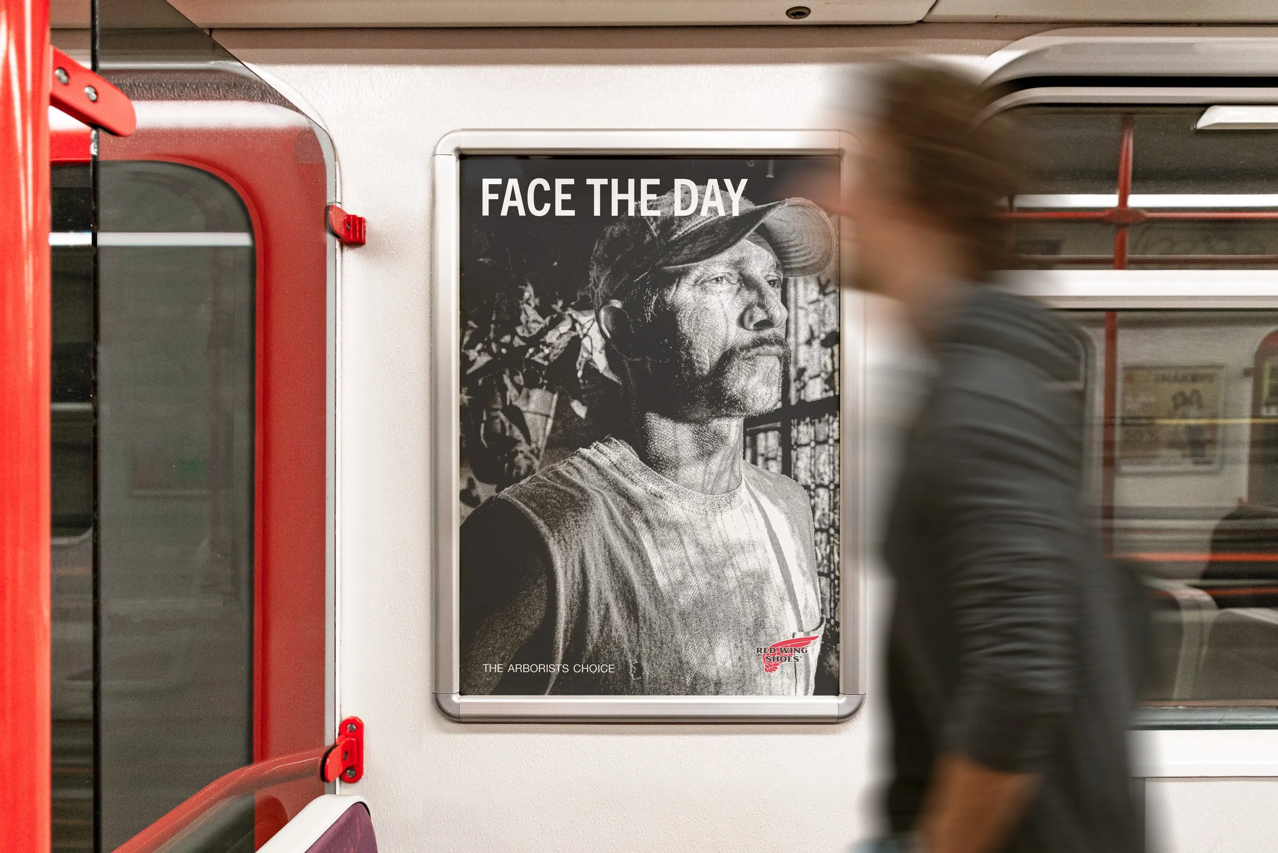
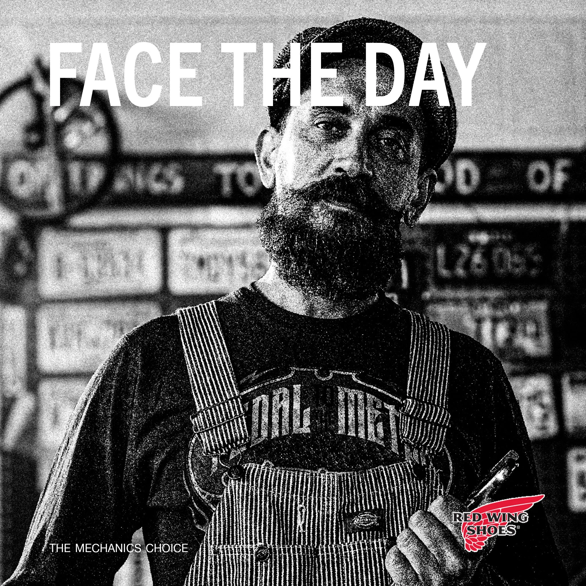
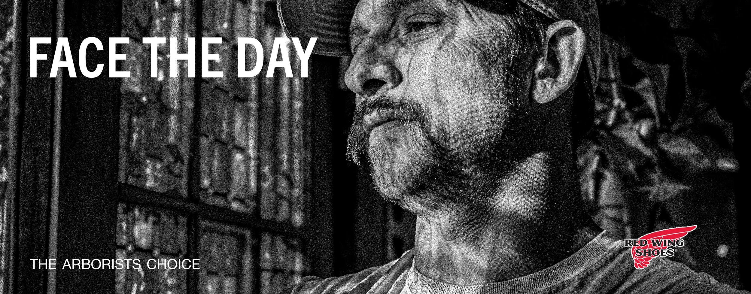
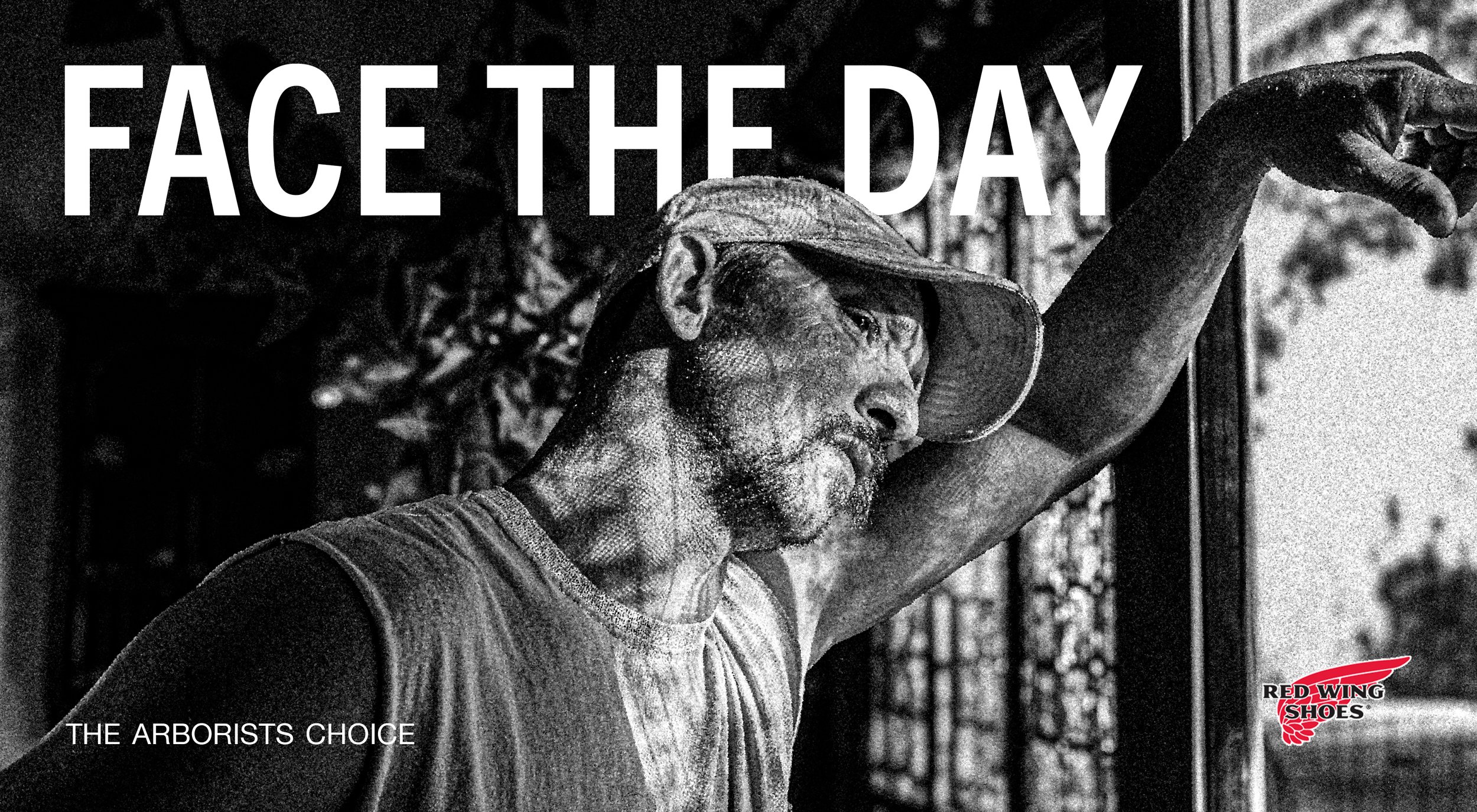
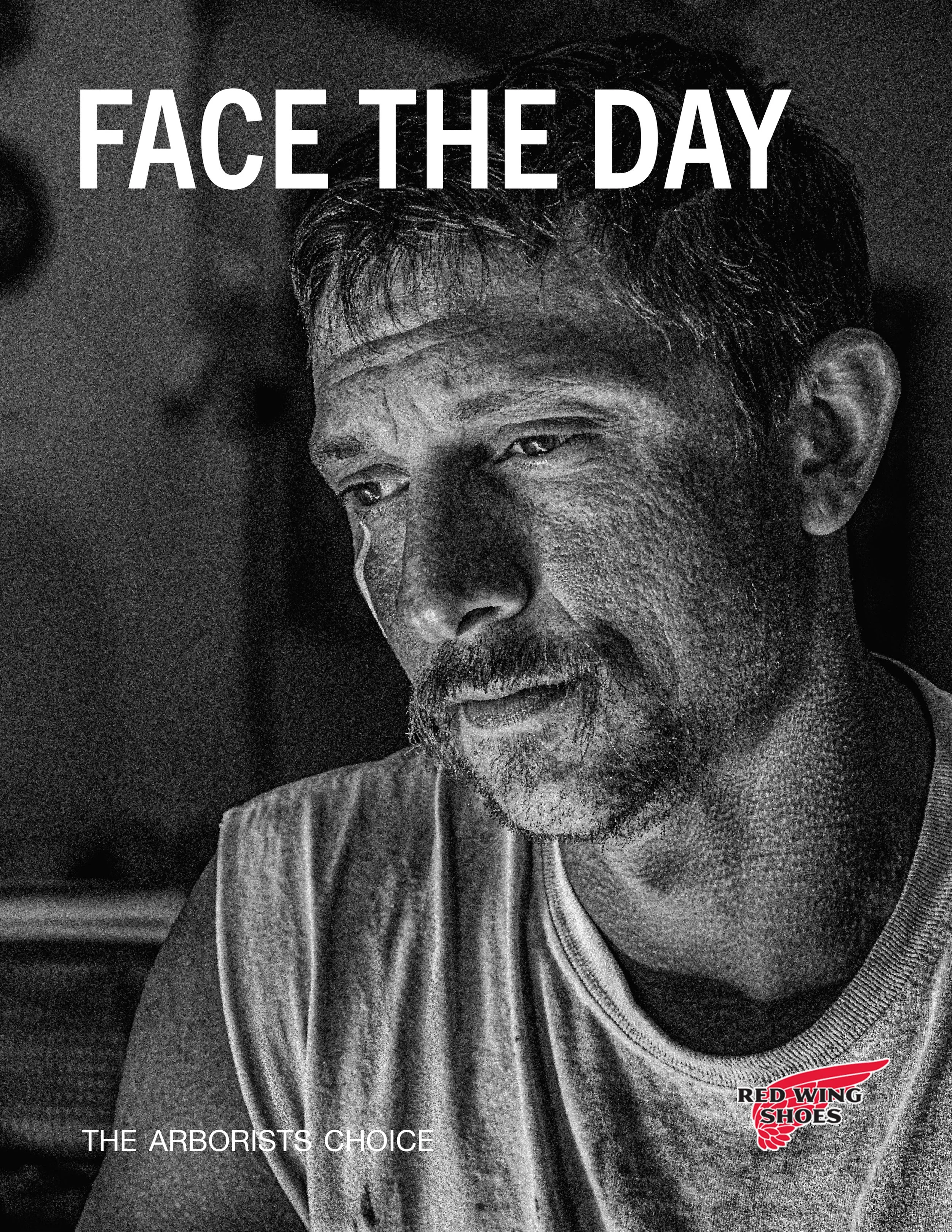
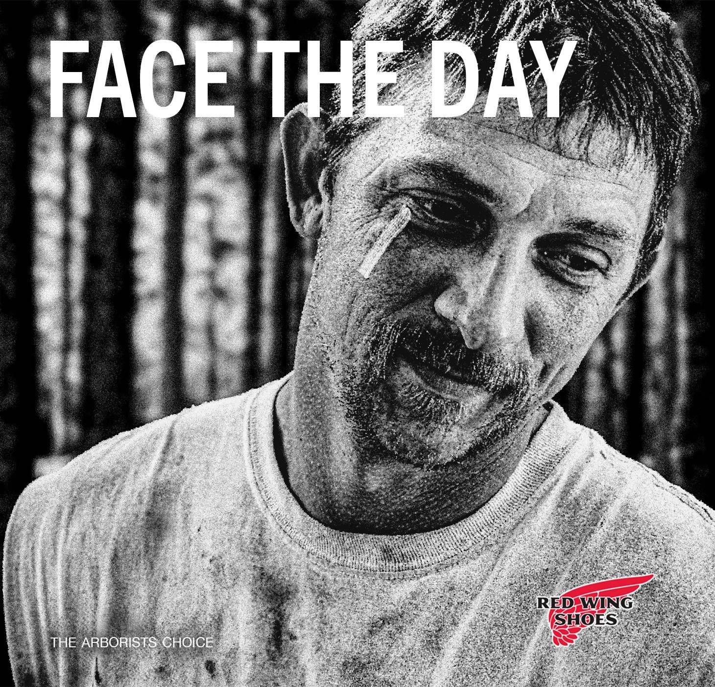
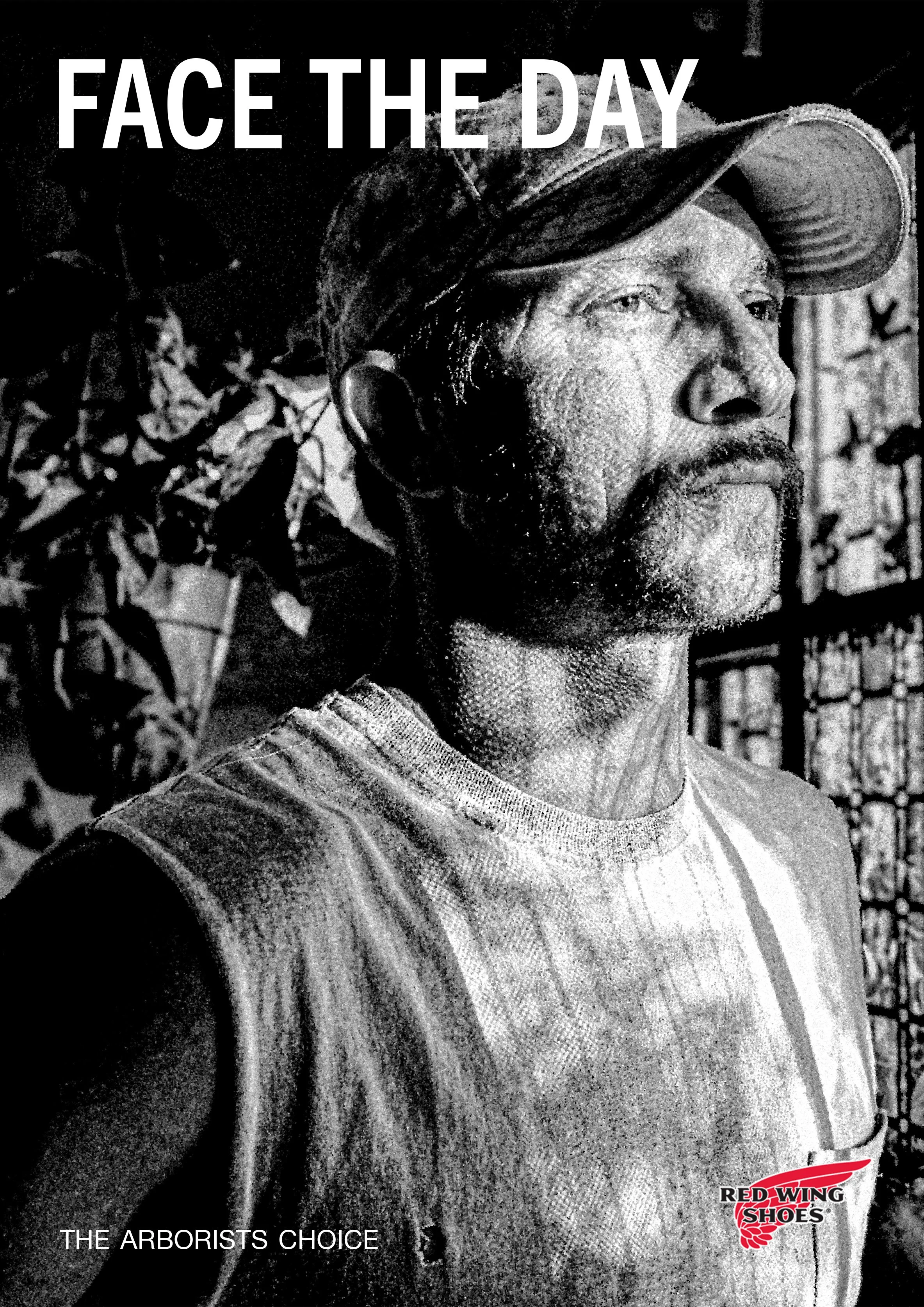
The second direction shifted toward a more human tone; quicker, more reflective. “Face the Day” became the message, focusing on resilience rather than brute strength. It felt more honest and emotionally grounded.
Second Ideation
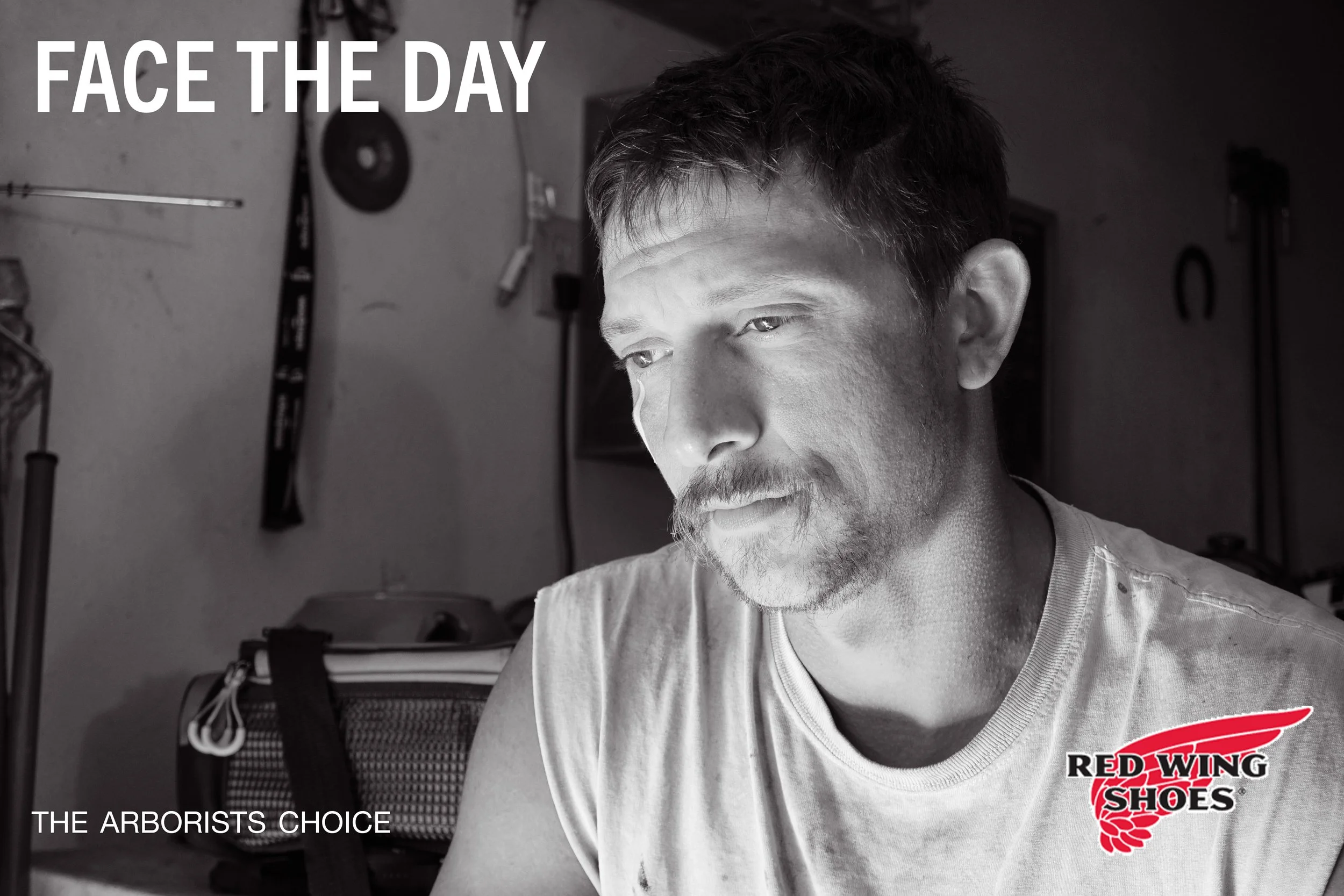
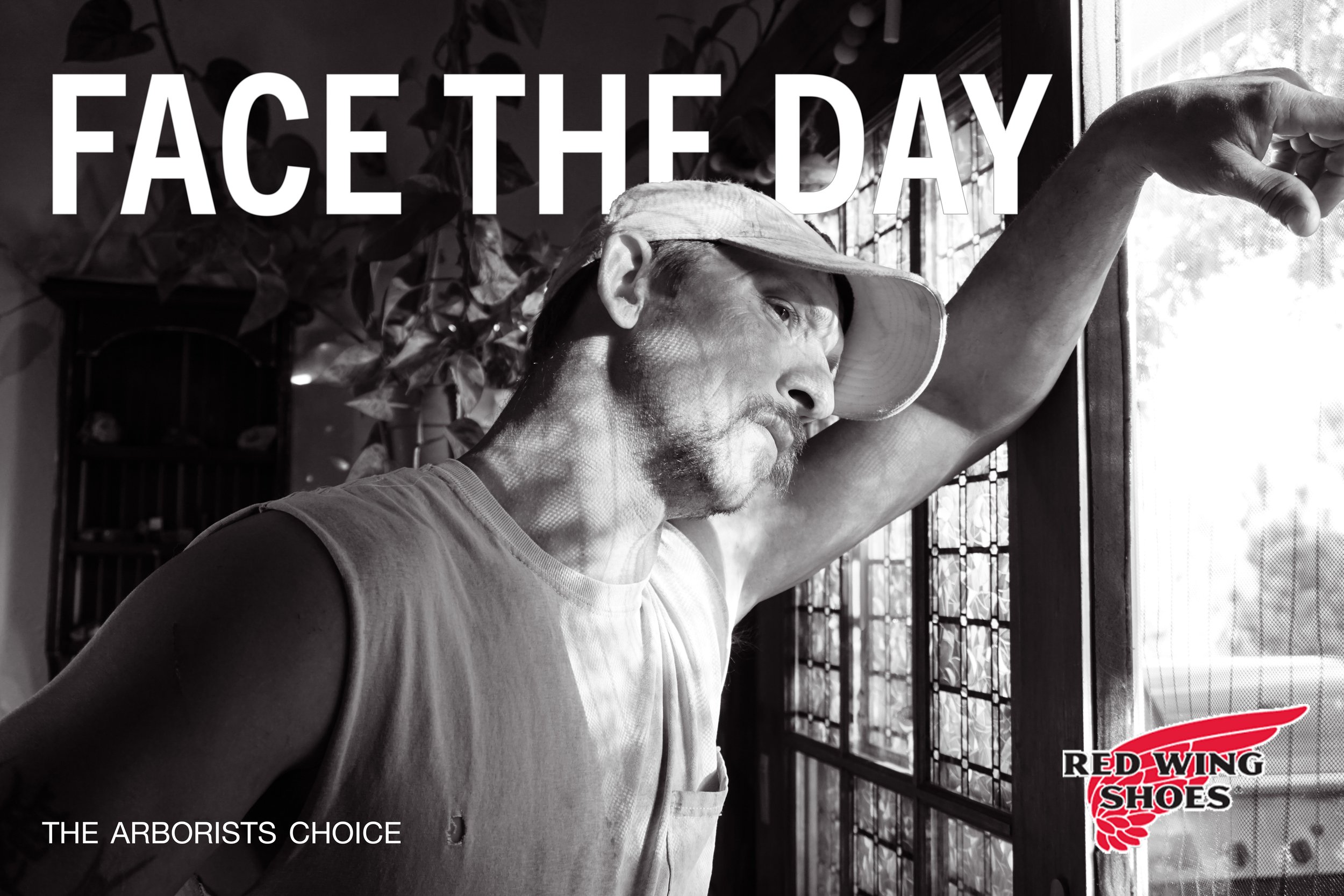
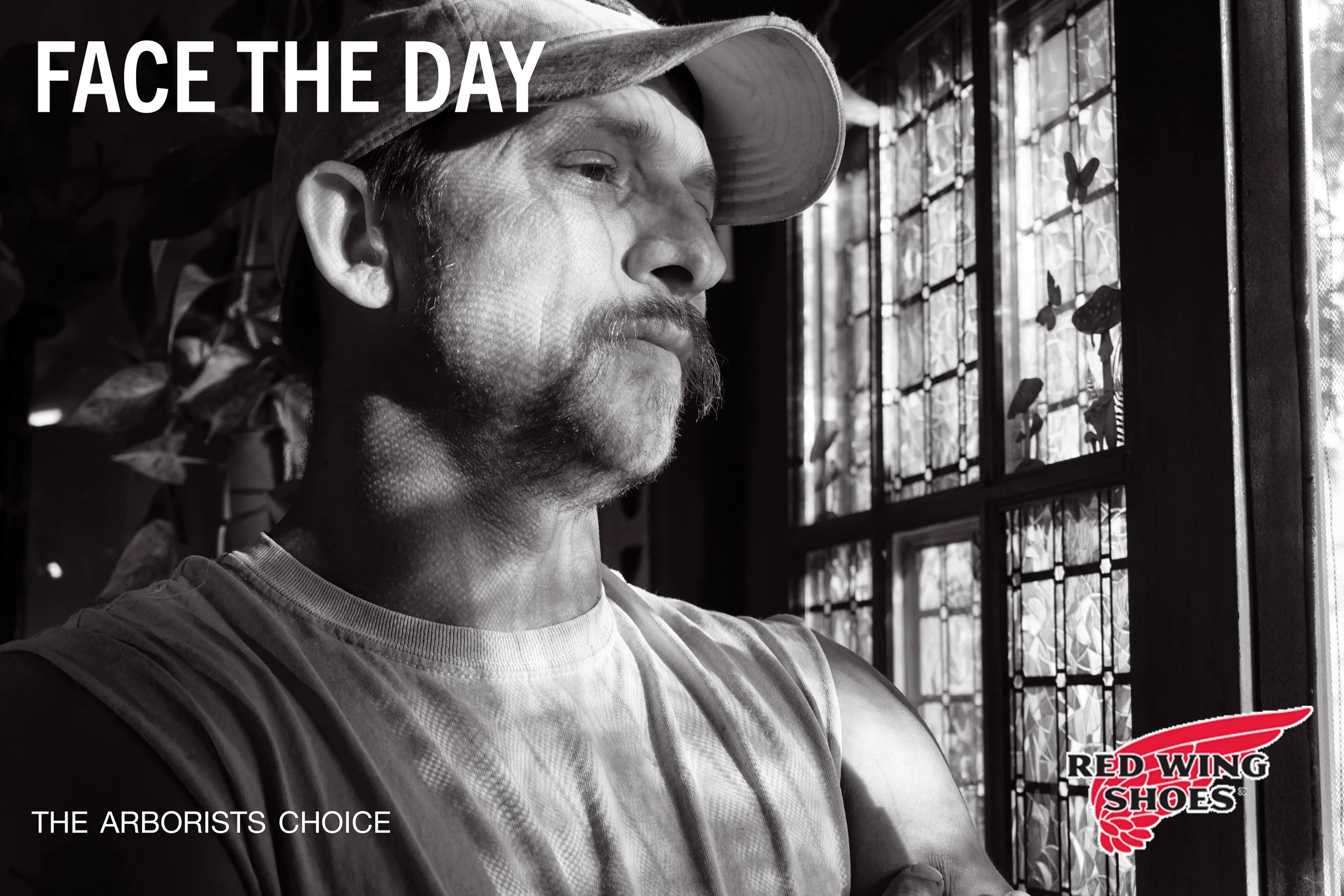
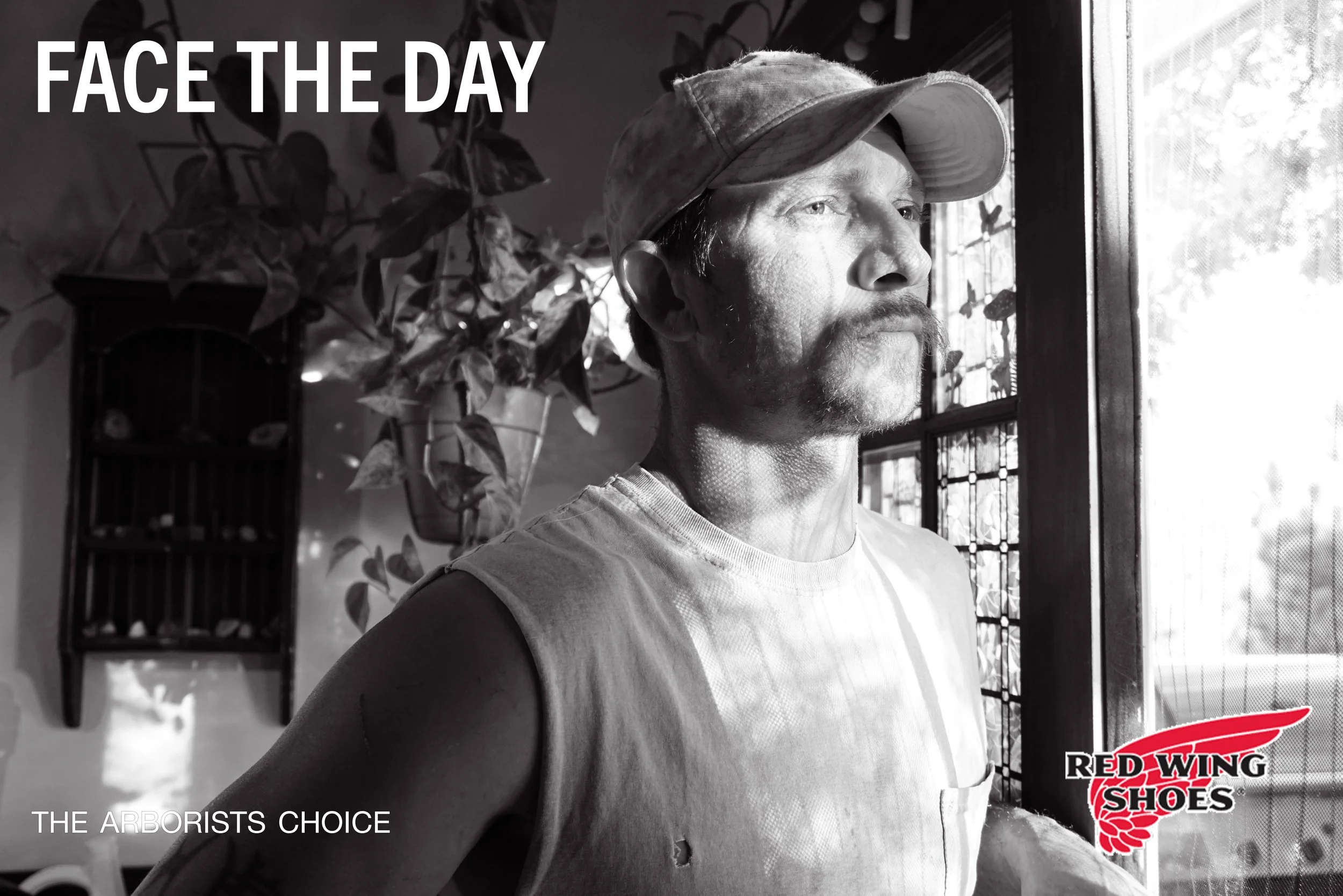
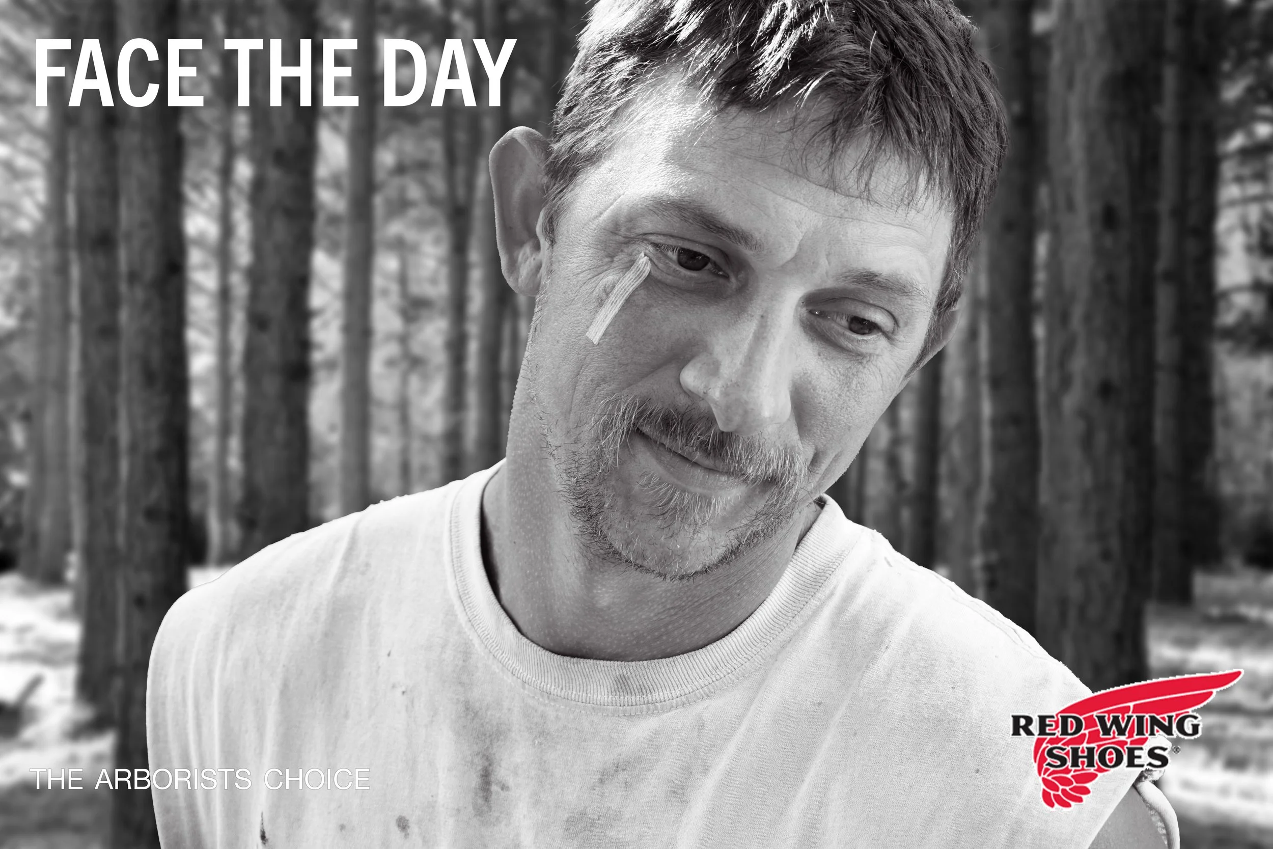
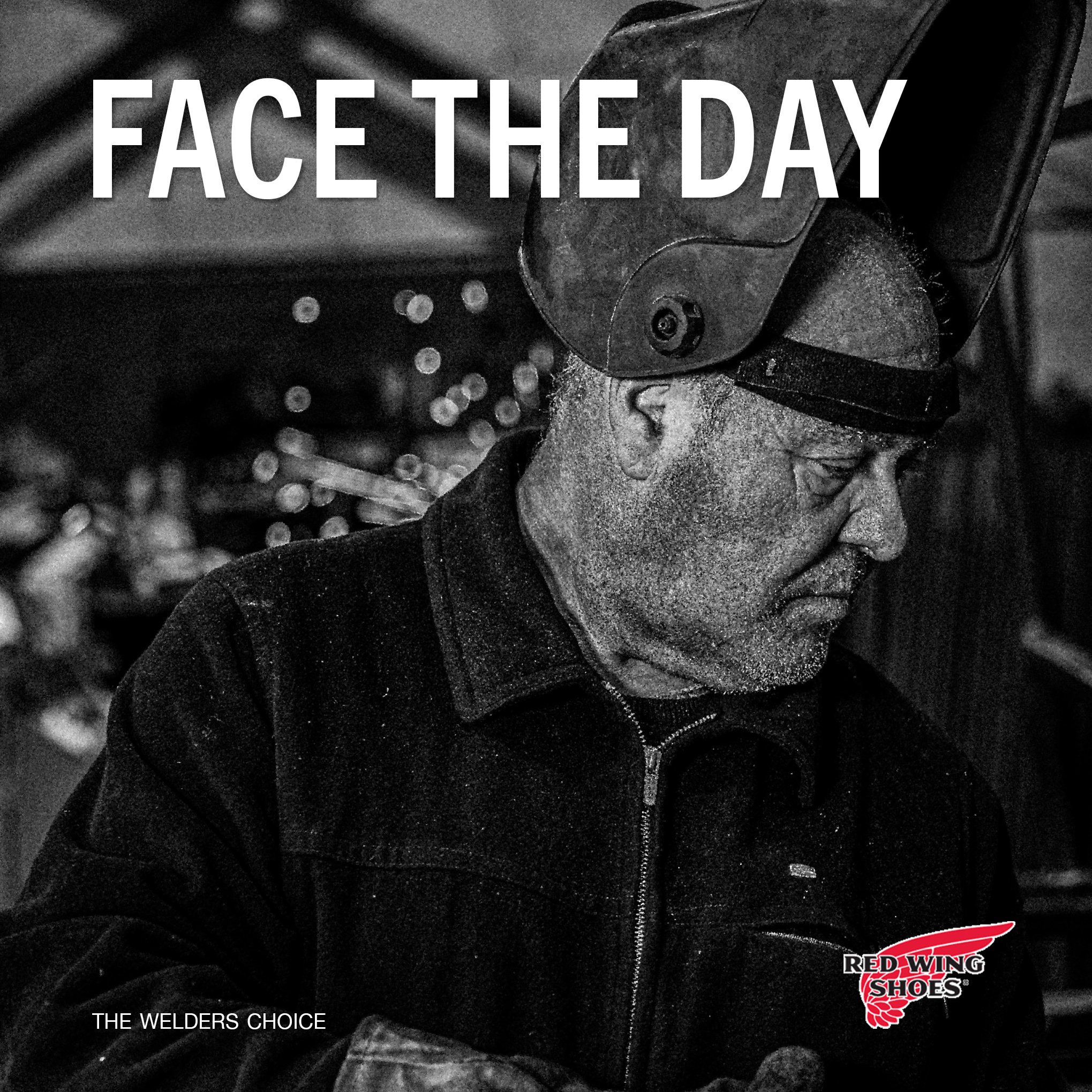


The final ads strip everything down to what matters: the worker, the boot, and the story behind both. Black-and-white portraits bring raw emotion to the campaign, while the typography adds confidence without shouting. It’s simple, strong, and exactly what Red Wing’s stands for.
Final Designs
My intent was to create an ad campaign that honors Red Wing’s hardworking legacy while giving it a more modern emotional tone. The goal was to show real workers, real grit, and a message that feels honest without over-styling it.
Project Intent
Environmental Contact