Cope with Creativity
A triptych poster series that draws inspiration from Vincent van Gogh’s words on creativity and healing. Each piece explores emotional recovery through color, texture, and type. Used to be a visual reminder that art has the power to mend what feels broken.
Programs
Illustrator and InDesign
Project Type
Triptych Poster Series
Purpose
Rocky Mountain College of Art + Design Course Project
Year
2025
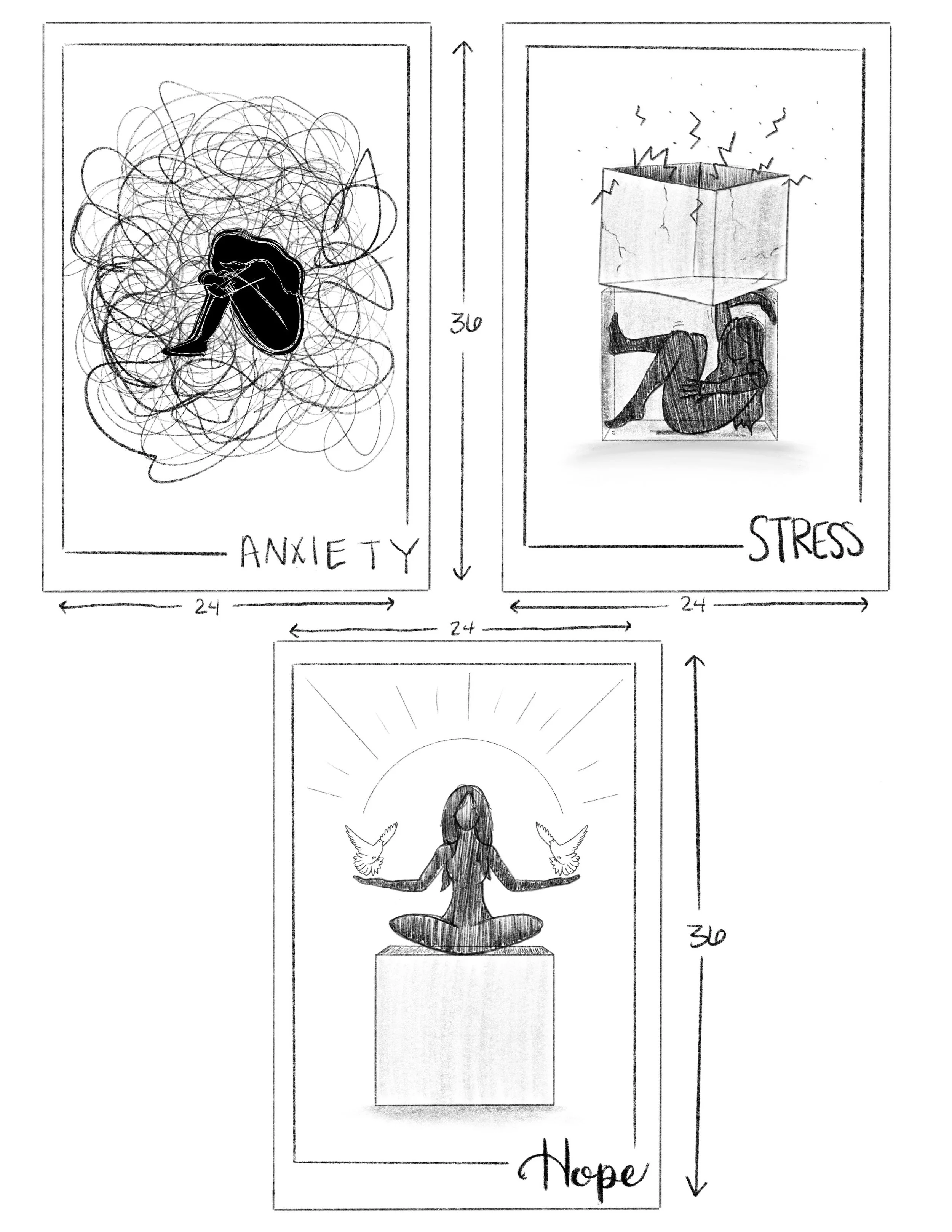
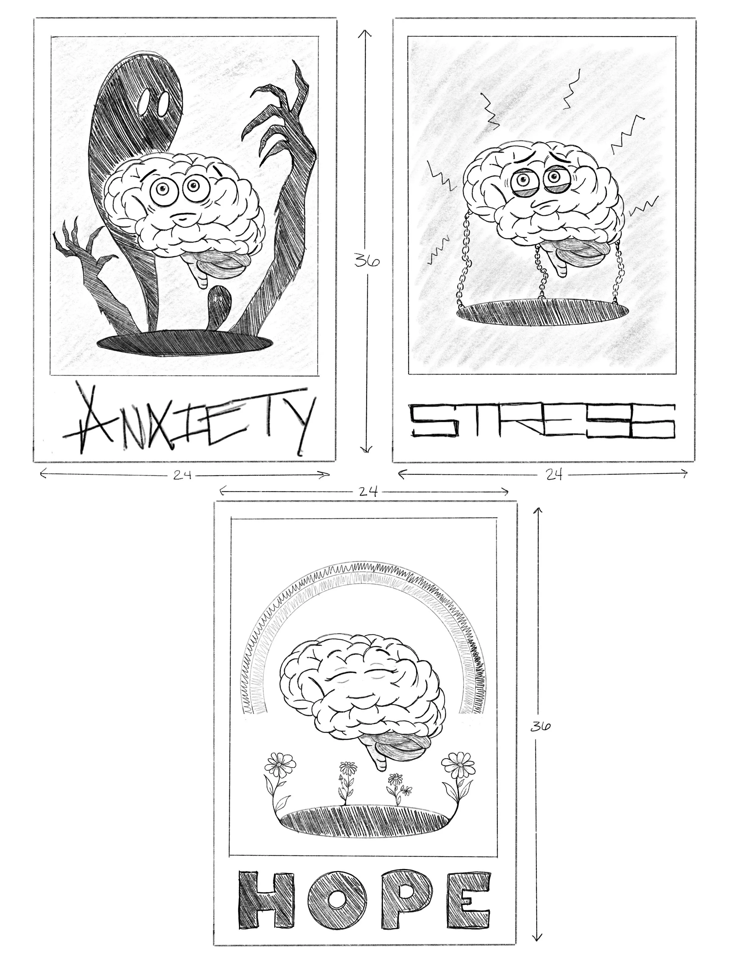
Starting with loose sketches to figure out how to show emotions like anxiety, stress, and hope without overcomplicating things. These early ideas helped me explore how each feeling could have its own visual language while still belonging to the same series. Simple, messy, and surprisingly helpful.
It all Starts with a Sketch
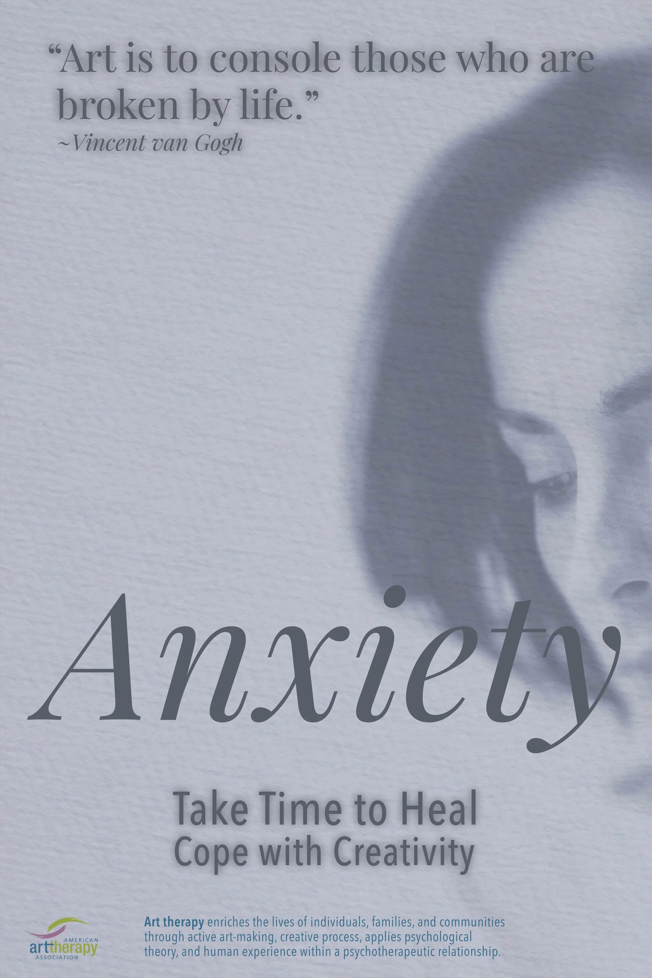
I kept the palette soft and emotional; calming blues, muted greens, and warm neutrals. These colors set the tone without overwhelming the message. They make the posters feel human instead of clinical.
A Splash of Color

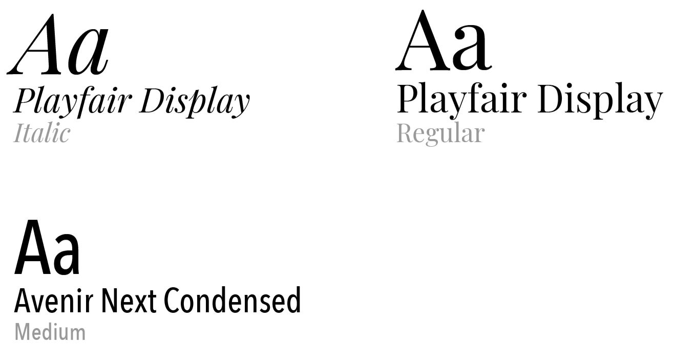
Playfair Display brings a little elegance and emotion, while Avenir Next keeps everything clean and modern. Together, they balance sensitivity with clarity.
Typography to Match
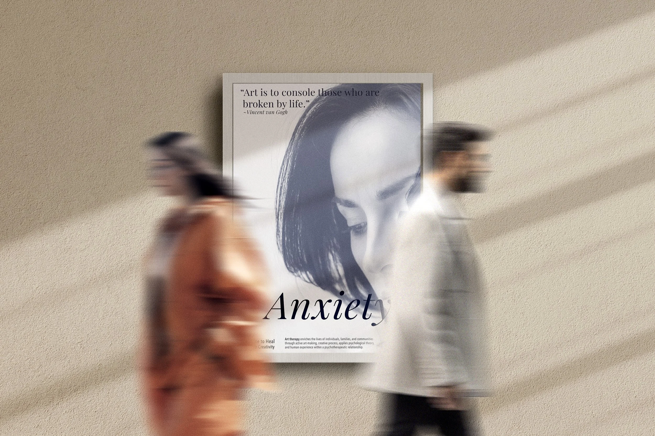
I took a photographic approach to capture more honest, real emotions. Soft lighting and color overlays helped show the nuance behind each feeling. It gave the series more depth and maturity.
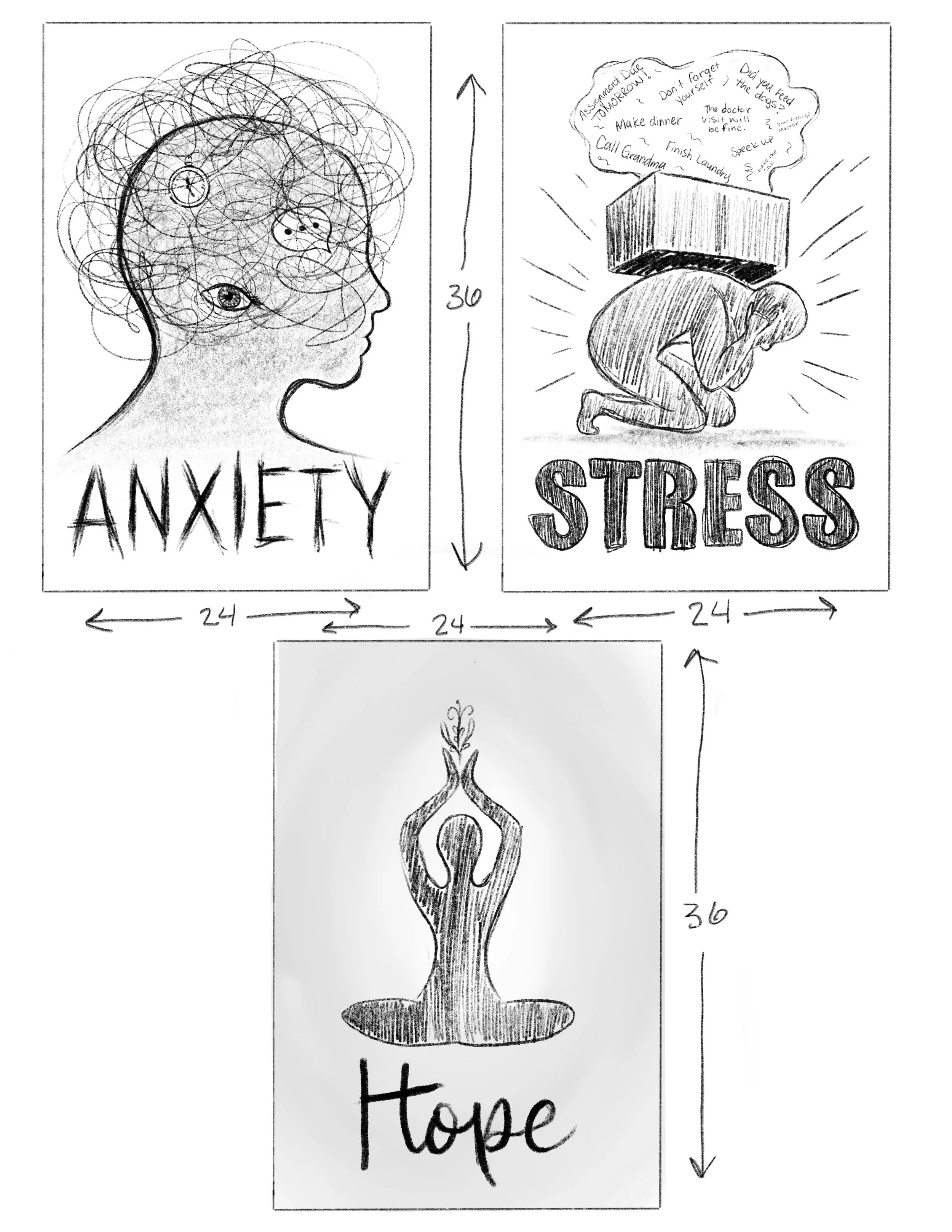
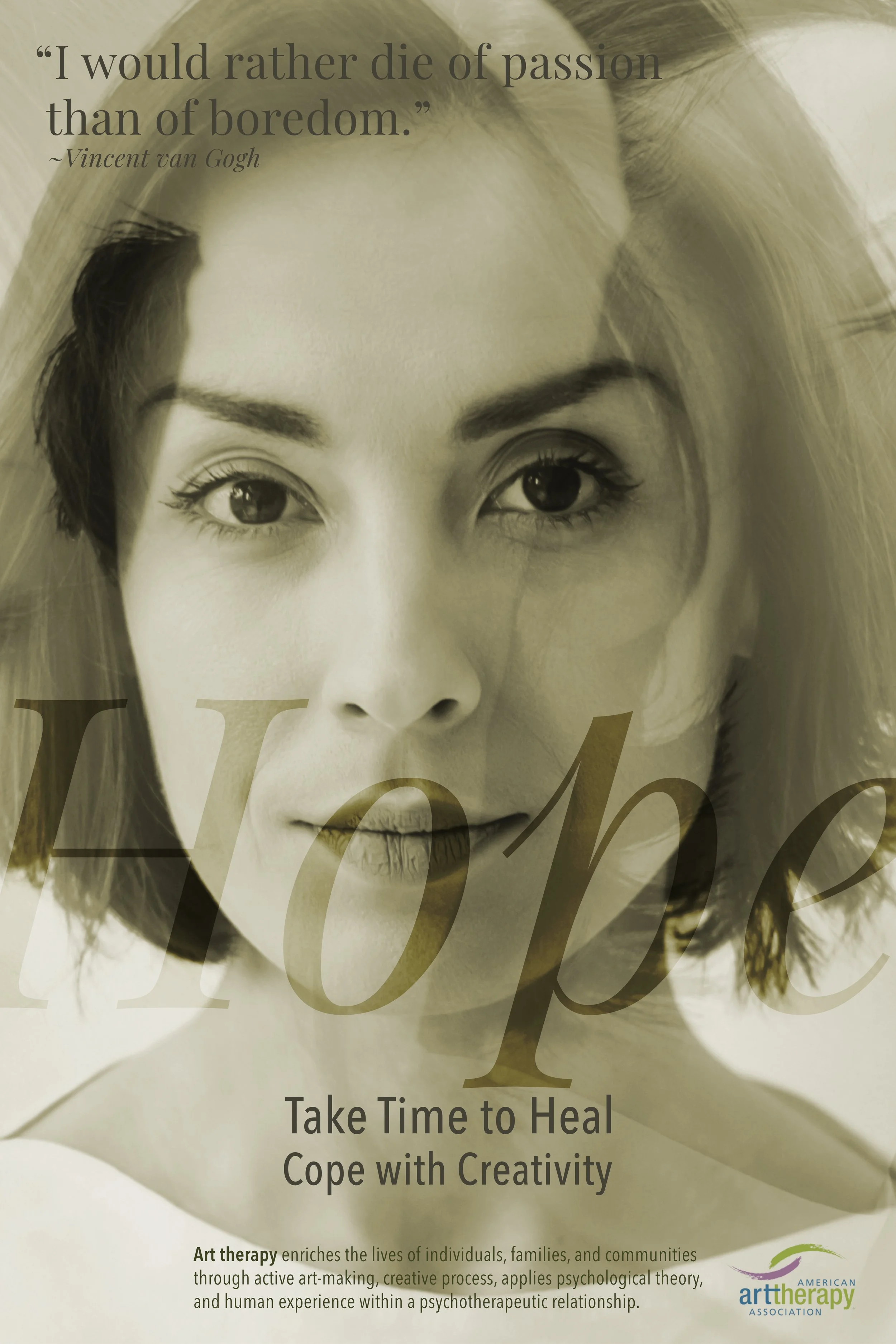
First Ideation
This version blended photography with subtle symbolic elements like shadows and shapes. It added texture and meaning without cluttering the design. This is where the concept really started to click.
Second Ideation
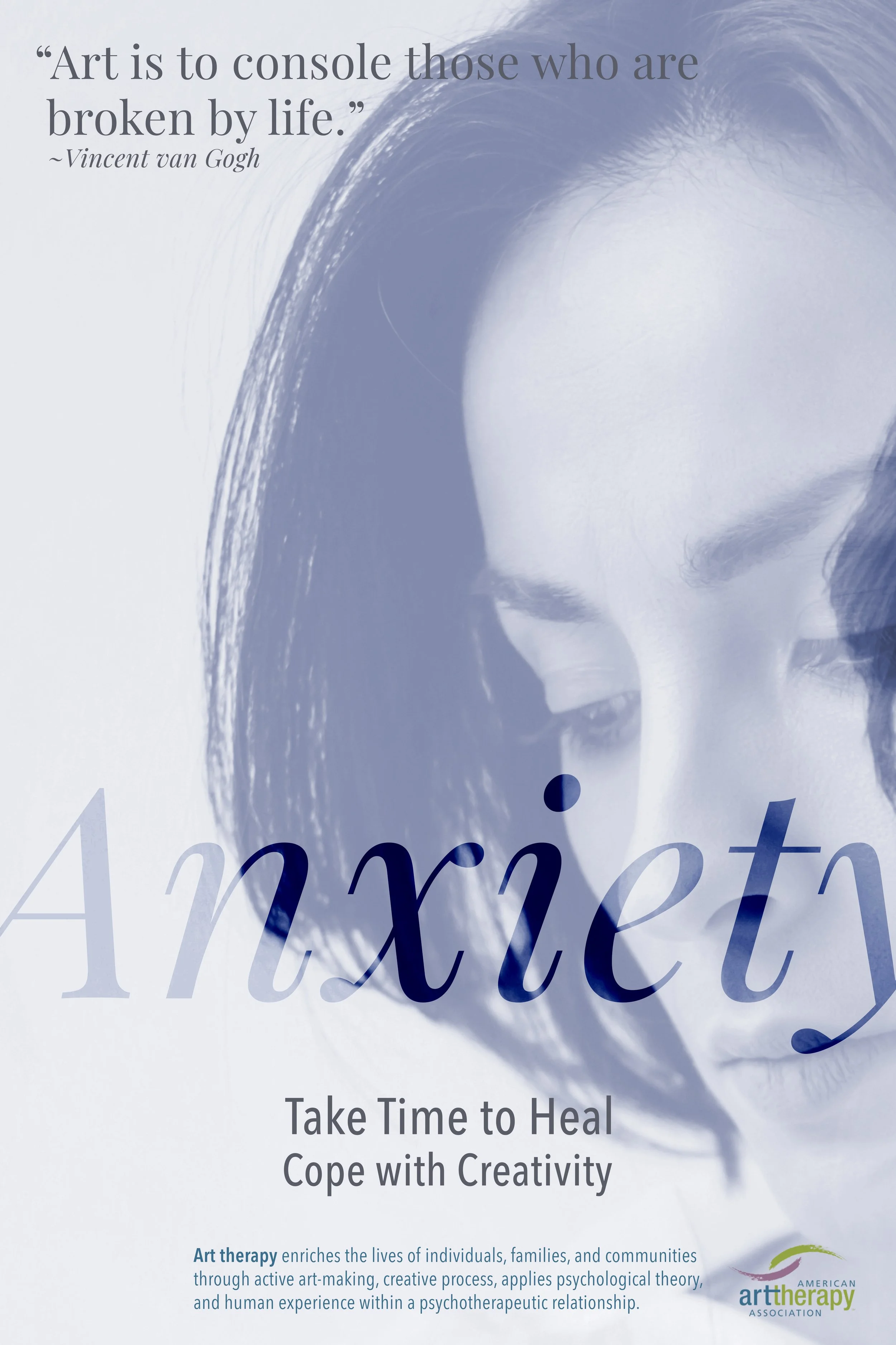

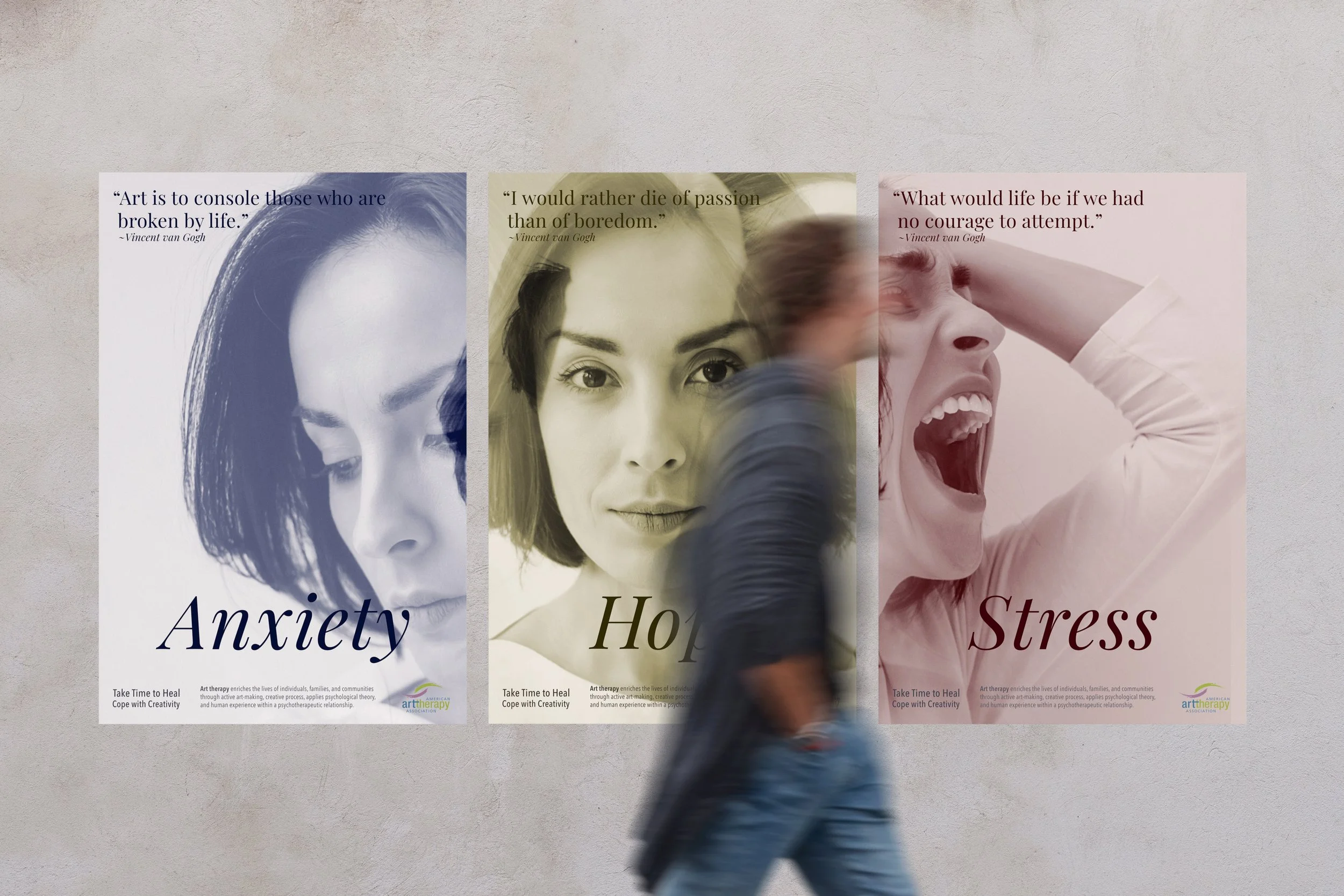
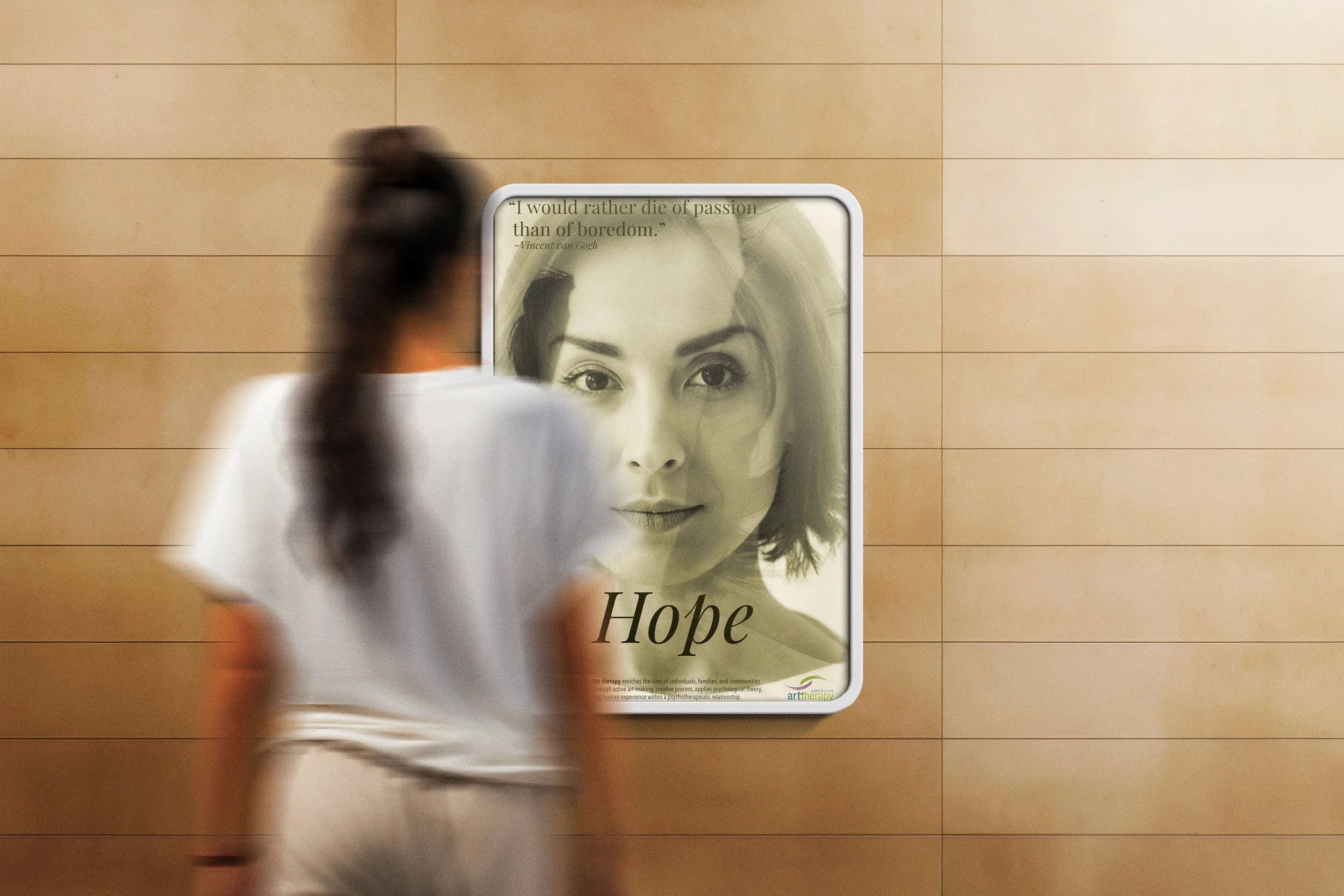
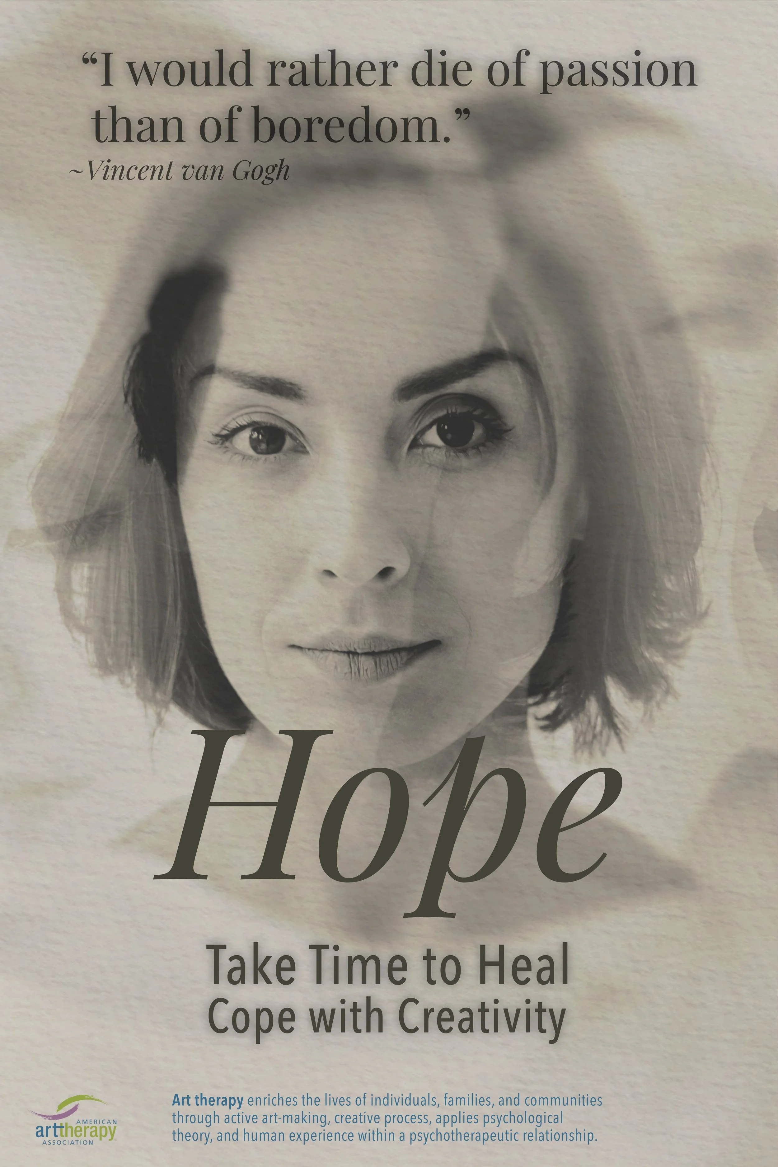
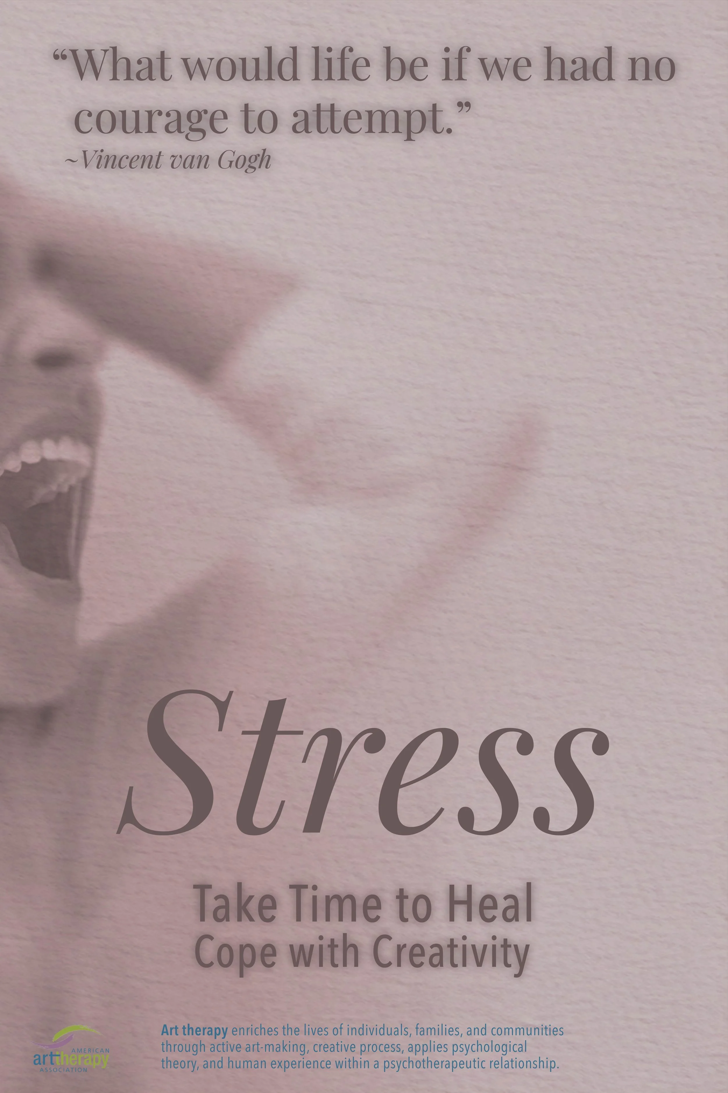
The final posters focus on clarity, emotion, and visual balance. Each one stands on its own, but together they tell a fuller story about navigating mental health. Clean, honest, and intentionally understated.
The Final Designs
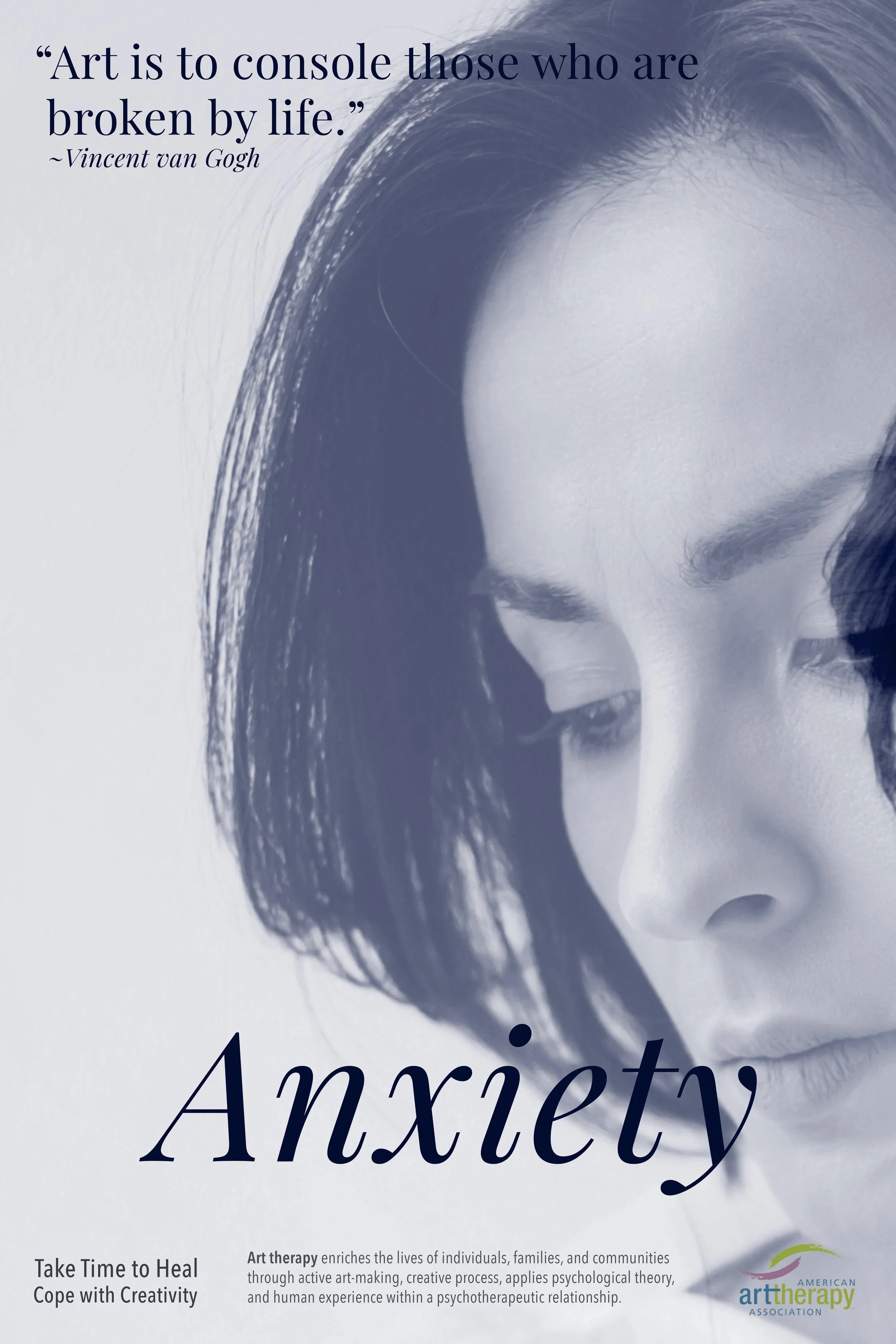
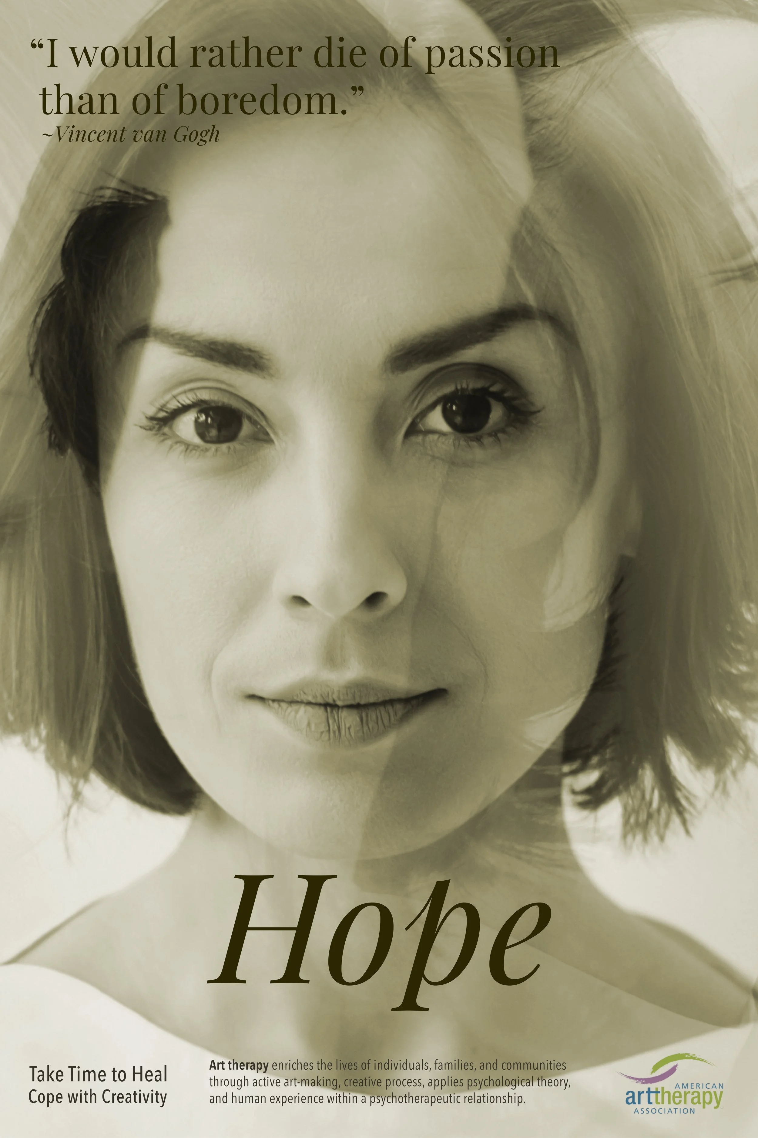

This project aimed to communicate heavy emotions in a way that feels human and approachable. I wanted each poster to stand alone while still connecting as a unified emotional narrative.
Project Intent
Environmental Contact